Get the top HN stories in your inbox every day.
nokeya
_the_inflator
Despite China, IT development is a complete disaster in Germany. All car so called German car manufacturers UX/UI is horrible to say the least.
Dieter Rams is the only UX/UI designer, who became famous - outside of Germany. Hartmut Esslinger kind of popularized DR, what an irony, that two Germans made history, but of course not in Germany and even in Germany DR wasn't well known. Braun was a brand and statement, but because the devices were and still are extremely convenient. Braun never put design or beauty in the spotlight - it wasn't recognized as such and therefore not of value to capitalize on.
VW? "No one needs Apple Car or Android. We are the world wide Nr. 1 in car business, what does a computer company know about cars? hahaha"
Hubris, resulted into a failed attempt to build in 2 years a complete Car OS. It was so bad, I was mocked back then, because I bet against it.
I am the only one who successfully build a No Code platform in financial services that became such a hit internally, that it became the standard. dbCORE is its name.
Very long story, but design by committee is the norm in Germany, and since outsourcing is the way to go, vendors sell changes all the time otherwise they lose the customer.
Value chains like Apple or Google are inconceivable and no one in Business has a background in CS.
Porsche 997-2 had the best UX/UI there was. Fantastic blend of nobs and touchscreen. It blew my mind, really. This was 2008. The iPhone came to light 2007!
Really, highly impressive, extremely functional and almost no friction at all. 90% was top.
And to the haters: Show me any company or product from Germany in IT that is Top 100 globally. Only SAP is or has been featured somewhere below the bottom. And I gurantee you, no one fell in love with its UX/UI...
Saline9515
Your comment reminds me of the hostile, to say the least, Munich U-Bahn map:
https://drmory.com/wp-content/uploads/2018/08/TARIFPLAN_Inne...
I remember seeing it back then in the subway, looking for directions and feeling really confused about it. "Damn why didn't I get a transportation systems PhD before coming to Germany!"
butlike
Hostile is the PERFECT way to describe that map. You got me chucking this AM.
GenerWork
The concentric rings remind me of atomic bomb destruction maps where they have different rings for different damage levels.
Archelaos
> And to the haters: Show me any company or product from Germany in IT that is Top 100 globally.
Also I wouldn’t want to disagree with you outright, there are still a few important German companies in the IT sector (or related): Siemens, Infineon, Deutsche Telekom, Bechtle, TeamViewer come to my mind.
What Siemens exemplifies is that the strength of German industry is not pure software, but high-tech machinery. While Siemens and most of its spin-offs are doing somewhat okay, the stocks of its spin-off Siemens Energy have risen by ~700 % in the last 3 years.
lb1lf
Where Siemens really shines, is in their fanatical devotion to after sales.
I rely on Siemens automation products at work. They give me end-of-life warnings a couple of years ahead - and maintain a spares inventory for a decade and change after EoL.
That basically ensures I am never caught out, and makes me more than happy to (grudgingly) accept all their ideosyncracies...
ofrzeta
Technically SAP is a Société Européenne but still somehow the biggest German software developer.
joe_mamba
>a few important German companies in the IT sector (or related): Siemens, Infineon, Deutsche Telekom, Bechtle, TeamViewer come to my mind.
None of them famous or being praised by customers for having amazing UI/UX though, because they're not consumer products, they're targeting engineers who either don't care about UX, or don't have a choice in the matter because their company is buying it, not them.
Cars on the other hand ARE consumer products and do need great UX, and German companies long forgot how to do that since they operate everything as a cost center and outsource everything they perceive ads no value.
>the strength of German industry is not pure software, but high-tech machinery
Yeah but there's more margins in pure software and more buyers in the world for consumer devices than for high tech machinery. Apple can probably buy all of Germany's machine tool makers if they wanted to. It's the perk of selling to 7 billion consumers in the world.
> the stocks of its spin-off Siemens Energy have risen by ~700 % in the last 3 years.
Just like every energy and defense stock in the world right now, but that's to be expected and somewhat offtopic for SW and UX.
If we look at some of their other consumer and healthcare spin-offs like Gigaset or Healthineers, they are doing insanely poor, which is embarrassing.
teamonkey
> Only SAP is or has been featured somewhere below the bottom.
“The company is the largest non-American software company by revenue and the world's fifth-largest publicly traded software company by revenue. In June 2025, it was the largest European company by market capitalization, as well as one of the 30 most valuable publicly traded companies in the world.”
marvin
High market cap but universally hated by its end-users is probably not a great yardstick to measure consumer software against.
Kurtose
Not a hater, just an example from today’s HN front page: Ableton from Berlin. World class UX/UI leading the DAW market for 25 years and counting. Not “Top 100” enough for validation? Just ask Thomas Bangalter. He’s taken it around the world to get lucky.
dahauns
Heh, when it comes to audio software, you could throw a lot more in the mix, e.g. Logic Pro, Native Instruments (at least in the past - shame what happened to them) and - arguably ;) - Steinberg among others.
sneak
Live is not world class UI. It’s great software but that’s despite the interface, not because of it.
Same thing with Premiere, or the Pioneer CDJ. It’s not the standard because it’s a joy to use, it’s a standard because it’s functional.
raxxorraxor
Software in Germany is simply not highly regarded, on the contrary. It is seen as necessary evil at best.
Ageing population that finds itself overwhelmed is my guess. There are exceptions, but they are far and few between.
jcgrillo
That seems like a good thing. Mostly software doesn't make people's lives better, instead it does the exact opposite. A society that recognizes that, and rejects the people who build it, is ahead of the curve.
1vuio0pswjnm7
Silicon Valley VC once wrote, "Software is eating the world"
donkyrf
My 992.2 has AA/CarPlay, and an outstanding user interface, with a nice mix of configurable displays and physical buttons. Fairly certain it is a top 100 product in it's market.
NetMageSCW
Yes, I think Porsche has a responsive excellent design with their infotainment / button combination though recent SUV / sedan models have moved to capacitive buttons and more touch screen controls and worsened the experience.
To be fair, it is outsourced to Harmon/Kardon.
chasd00
> My 992.2 has AA/CarPlay, and an outstanding user interface
kind of ironic because, IMO, the only priority for UX in a car like that is a steering wheel, gas pedal, and brake pedal.
/not jealous.. well maybe a little :)
BrentOzar
The cup holder situation, on the other hand… (992.1 owner)
rconti
see my comment about shopping for a used Macan, and avoiding 2022+ with the haptic BS.
torginus
In the defense of VW, their EVs launched with absolutely horrible software, but apparently its pretty good now, and its still the same indigenous platform.
And to join in the bashing - I once went to a tradeshow where a software company building infotainment for high end Mercedes cars told me the cars are running k8s clusters with multiple computers.
Not sure if that's the red flag I make it out to be, but it sure doesn't inspire confidence.
the_mitsuhiko
> VW? "No one needs Apple Car or Android. We are the world wide Nr. 1 in car business, what does a computer company know about cars? hahaha"
VW was supporting CarPlay from launch and the VW MEB dash was on all pro material of Apple for ages.
virtualritz
Ever heard of CARIAD, the biggest trainwreck, er carwreck, of a software company south of the north pole?
6000 people to develop a software stack for VW.
Go figure. The fact VW supported CarPlay early is footnote in this comedy.
riffraff
I hadn't heard of this china regulation.
Perhaps we will have a "Beijing regulatory effect" positively impacting the world like the Bruxelles and California ones.
throw848tjfj
Already happening, best example is worldwide grounding of Boeing 737 MAX. It was China who triggered it, not US authorities (protecting US corporation).
Similar thing with batteries on airplanes, tube trains, ferries and underground garages. China cares about fire hazard, other countries care about ideology.
wiseowise
> other countries care about ideology
Not even ideology anymore, see US. Democratic country has been attacked in a biggest war since WW2, and they've decided to halt all support and attack Iran instead.
noelsusman
China, famous for never putting ideology over policy.
lqstuart
Too bad they don't care so much about factory worker safety or slave labor
Scroll_Swe
China glazing on HN, wow what a suprise!
drstewart
Wow, that's amazing. What fire hazard are they preventing in their support for Russia's illegal invasion of Ukraine?
justonceokay
It’s funny you say that because the China “anti regulatory effect” of the 90s-2000s also had a great impact on quality of life for the world in its own way
throw0101c
> […] but because China requires physical buttons starting next year.
European safety ratings also mandated buttons in 2024 (for this year) for certain functions:
* https://www.euroncap.com/press-media/euro-ncap-announces-202...
* https://etsc.eu/cars-will-need-buttons-not-just-touchscreens...
ygra
Euro NCAP will also only give the highest safety rating to cars with physical buttons for common functions.
mihaelm
Dunno, people hate the all-touch trend so much (I've never come across someone who likes it), it surprised me it took them so long to reverse course.
Rebelgecko
It seems cyclical. Maybe the people who stand up for good UX retire and it takes a few years for a company to realize that they're going in a bad direction.
Mazda used to have do the best most user friendly controls and bragged about it as a differentiator... but the new cx-5 is a touch screen-only monstrosity
beachy
Anyone exec wanting to move away from touchscreens and back to buttons would have flashbacks to Steve Balmer mocking the new iPhone and stabbing his fingers at the touch panel and making a fool of himself for eternity.
rossjudson
I have an Audi Q7 and a model X. Don't miss the physical controls of the Q7 at all. Given a choice between Tesla software and Android Auto, I'll take Tesla's.
Then again, I'm someone who likes the yoke steering, and invested a few weeks acclimating to the lack of steampunk turn stalks.
For physical controls, it always comes down to "What did you want to do?" There are very few that are actually needed.
jjtheblunt
well their F1 yoke uses lots of buttons, and makers often roll insights from F1 into production cars
https://sim-lab.us/cdn/shop/files/mercedes-product-image.png...
mock-possum
So what’s the next link in this chain why is china ‘really’ requiring it?
mghackerlady
safety, probably. Why do we require cars have functional brakes?
Animats
But do you have to look at the display to tell what the buttons and knobs are doing.
If you have, say, a HVAC fan speed knob with mechanical stops at the low and high end, and a detent, you never have to look at it. If you have an increase/decrease switch, you may need to look at the display to find out what you're doing. In a car, this means head-down time, eyes off the road.
I have a Black and Decker branded humidifier, which comes from "W Appliance Ltd", a licensee of the Black and Decker name. It's an ultrasonic humidifier with a 1.45 gallon tank and a big filter to remove dissolved solids, so it runs well on tap water. It's an effective humidifier.
This device is an example of how to botch the user interface for a very simple device. There's a big round display, about 12cm across. This has various dedicated icons and a central number display. Around it is a ring which displays a moving bar pattern when the device is running.
From left to right, we have five buttons. They're just touchable areas on the case, not actual pushable controls. The first button is On/Off, and, inevitably today, the same button does both functions. The display lights up when on.
The second button turns on a negative ion generator. This isn't an advertised feature, and it may not actually do anything. If this feature is on, a tiny icon illuminates on the display. This thing is down on the floor and you can't see the smaller icons without getting down on your knees. If you hold this button down for two seconds, the decorative bar pattern on the display is toned down, but not fully turned off.
The third button is fan speed. Available values are 1 to 3. Default is 2. 1 is useless, and 2 is mostly useless, because the water condenses on top of the unit rather than humidifying the room.
The fourth button sets the humidity. Values from 45% to 90% can be cycled through. There's one two-digit display, and it shows the humidity being set when the button has been pushed recently. Otherwise it shows the humidity being measured.
The fifth button sets a timer to turn the thing off after some number of hours.
When the water tank is empty, a tiny icon illuminates. The main display does not change or go dark. The one actionable piece of info the device can give the user is barely visible.
Removing the water tank or turning the device off resets all settings to the defaults. So after each refill, the user must go through setup again.
There's an optional remote available, with the same five buttons.
All this thing needed was one big knob for setting the humidity, with an off position. Plus a nice big indicator light to indicate an empty tank. Instead, they designed a complex user interface that makes it worse.
This kind of mistake appears when UI people design button systems.
Night_Thastus
Just so you know, no normal filter can actually remove anything dissolved in the water - like minerals or salt. The only way to remove those is either ion exchange (ie: water softening, replace the hard minerals with salt) or reverse osmosis.
There's no way it's either of those, because both would be bulky. And if it was RO, you'd have a separate wastewater tank you would need to empty very often.
All that to say, that humidifier is still blasting minerals all over the surrounding area (and into carpet if you have any), which will leave deposits on everything. And if it's near electronics, it can fry them given enough time. Be warned.
topdownijk
You did buy it though
m463
I think they should distinguish between controls and settings.
Settings are great on a touchscreen. A wide variety of options, easily navigated to and explained. They suck on physical buttons, it ends up being like setting the time on a VCR.
Controls on the other hand deserve physical buttons. Or levers. or dials/knobs/spinners. It should depend on muscle memory, and the type of control.
I also thing driving status should be on a dashboard in front of you, not on the central display. (looking at you tesla)
And some should be multiple places. It might be nice to set your volume with a physical knob, but also on the steering wheel.
sgustard
I used to drive a 2001 S-class ... easily counted nearly 100 physical buttons within reach of the driver. In theory you could use the 10-digit keypad like an old flip phone to enter a physical address into the navigation, but is that really what people want to go back to?
m463
I missed navigation.
I think it is a natural fit for the touchscreen. Tesla navigation is not perfect, but it is very good. You can pan/zoom the map with swipes which is LOTS better than buttons. You can also search for an address in specific or general terms and are not forced into some highly structured address format.
For example a ford I used had this weird out-of-order way of "enter street number" or "enter zipcode" and "enter street name" with a weird type-ahead/completion that was just... bad.
With tesla, you have a search field. You can type "123 main street, anytown" to find a specific address, or "home depot anytown". But you can just type "home depot" and choose from the list which puts recent on top, then closest to furthest. They also show up as pins all over the map and you can just choose one.
I guess you could also use voice nav. I kind of hate voice nav that is uploaded to the cloud (and they lie) I have an offline garmin car gps that lets me talk to it.
CrimsonRain
Some people just want a faster horse :)
andrewaylett
I have a pre-facelift MB A-class, and I think it's the best car I've driven for controls. You don't have to touch the screen ever if you don't want to: there's a trackpad on the centre console that just works even (most of the time) with Android Auto (and the back/home/map/media/phone buttons will still save you even if Android Auto won't always let you move the cursor to the back arrow in YouTube Music). The steering wheel has two touch-sensitive buttons, one for each screen (duplicating the trackpad, which itself duplicates the media touchscreen). I can't even easily reach either screen when driving, so I don't.
Driving controls are all available on the stalks and wheel, volume is adjustable from the wheel or the centre console, all physical buttons, levers, or scroll inputs, unless you need to change a setting using the trackpad. The only thing that's missing is wheel control for skipping tracks :P.
yourusername
And then in the facelift they replaced the buttons on the steering wheel with touch sensitive ones and just removed the touch pad and replaced it with nothing. It's still useable and nice, but worse than the older model and there was no need to change anything.
throwawayk7h
this is an incomplete picture though. Would Google Maps be considered a control or setting?
andrewaylett
You probably don't want to be setting up Maps on either a touch screen or a with keys while driving. But navigation and media selection are the two functions I'm generally happy to interact with via voice.
lurking_swe
both. the map has many detailed settings which you might change once in a while.
there are also certain things you’d want to change (or activate) often - we could argue those are controls. Like muting, changing volume, or finding a nearby gas station.
pcurve
love that distinction.
teo_zero
And for those commands that do not deserve a physical button and are only accessible via touch, please adhere to a few simple rules.
1. Put them always in the same place. Especially the "back" or "exit" button!
2. Each button should do one thing, not switch between 3 or more modes that you should look to understand which one you've just activated. Negative example: one button to cycle from cuise control, to drive assist, to speed limit, and back to off.
3. The area where a tap is interpreted as a button press should not also be where a swipe is recognized. In moving vehicles it is too easy for your finger to swing just an inch before touching the screen.
4. The active area of a virtual button must be large, larger than the icon it displays, so large that you shouldn't be distracted from driving just to aim at it!
beachy
Also - move the tech forwards! Buttons can be cool. Software controlled detents for rotary encoder knobs, back lit stream deck style buttons, cool knobs that combine twisting and pulling in/out.
ted537
Twist it! Bop it!
brikym
1. Drives me crazy on iPhone. On Android there is one button to go back. Very simple. On iPhone sometimes it's top left, some times it's called 'done'. Sometimes the app doesn't have it at all and I have to use a menu instead.
geodel
Last time it was VW bringing it back, then Mazda bringing it back, and so on. Also luxury cars will not use touch controls, thats only for cheap cars.
It appears wishful thinking that physical buttons are coming back. This would be an idea whose time has gone. It does not even matter companies that physical buttons are better, or they can offer as choice (at higher price) if someone wanted.
Like remote working, office cubicles, fast and lightweight websites, ad-free content, one time purchase software incentives of all parties are aligned against people who bear cost of these decisions. So I do not expect this to change.
phatfish
But VW are bringing them back? The ID.Polo (seems like they dropped the Playstation style incrementing number for the old brand names) is the first of their new electric range with physical buttons for windows, climate, etc.
Basically the door and centre console have them back. Along with a touchscreen of course.
mrweasel
The VW ID.4 also seems like a gaming console. The steering wheel is full of capacitive buttons, you never know what you might accidentally activate or adjust.
If you just want to drive it's a really nice car, but the overuse of capacitive buttons on the steering wheel and key fob really lets the rest of the car down. The key fob is easily worse than that of a 2012 Renault.
Assuming that VW is returning to buttons, I can assure you that it was not for the 2025 models.
gonzalohm
When did Mazda get rid of buttons? They always provide both choices no? Touchscreen and the dial (which I love). Temperature controls are also physical.
Except for the new 2026 models. I think those removed physical buttons
Geonode
I think you answered your own question. 2026. My 2025 CX-90 has amazing controls.
LoganDark
You answered your own question...
jval43
Even Toyota is going touch now, with the 2026 models lacking climate control knobs.
I don't know why. Every review always praised the previous models for the physical buttons, and literally nobody asked for them. The physical buttons were perfect, yet they've taken them away.
There must be some grand anti-button conspiracy, it just doesn't make any sense.
mparkms
Chasing trends and it's now cheaper to have a single touchscreen with software controls than to design and manufacture physical controls.
vachina
There’s less need for a physical button for those things now that climate control algo has become so good it has been on Auto the entire time for me.
bluGill
A screen costs 75, a button is 1 each. You get a lot more that 100 buttons on a screen.
Not to mention the physical space a button takes.
swiftcoder
Is is Mercedes-Benz deciding to bring back buttons, or is it that the EU's NCAP safety rating mandated that they bring back buttons, and they are spinning it as a voluntary decision?
rsynnott
I'd assume some combo of NCAP and the new Chinese rules, yeah. Though consumer backlash may also be a factor.
user3939382
My money is on the latter. I’ll take it, but being bullshitted by these big corporations is the norm.
Auto makers have been aware for years of consumer sentiment around the physical dials is my guess based on the complete consistency I’ve seen.
aenis
'He also explained that "I'm a big believer in screens, because I really believe if you want to connect, you have to make the magic work behind the screen." '
I am a big believer in keeping "product people" away from UI design for dangerous machinery.
The eyes and the attention of the driver should be on the road. All the audio visual noise from the car is just plain dangerous. I don't want my car to draw my attention to itself for anything less than a critical engine/tyre pressure failures. I do not want beeps on anything else distracting me while I am driving.
My Volvo will, for instance, flash the same type of visual alert when fuel level is low (permanent "do you want to navigate to a fuel station" modal window obscuring navigation, speedometer and so on) -- as when it encounters a serious engine malfunction. It will steal a bit of my attention when it pops up. One of those days, someone will have an accident because of this moronic design, its statistically certain.
Same with wipers fluid level low. I need to click on the button to hide the message.
It will on occasion beep very loud when it thinks I am not braking hard enough. The map in the google android car navi rotates when i am just trying to pan. When I want to select an alternative route I need to very precisely touch a very small area on the screen, and more often than not instead of selecting the alternative route it will actually rotate the map.
It is clear to me that either the people designing car UIs are staying away from those cars, or are just incompetent. (Or, I guess, both).
Conlectus
The thing that everyone always misses in these conversations is that screens over buttons is a cost cutting measure, not a first-principles design decision.
It means the UI can be designed and developed mostly independently of the physical controls, which helps reduce rework. I also expect it reduces costs for manufacture and assembly.
I’m in favour of more physical controls, but it surprises me that this rarely comes up. I suppose “people are idiots” is a more appealing explanation.
aembleton
Somehow, the Dacia Sandero has physical controls for climate control and physical buttons on the steering wheel. It manages to do that whilst being one of the cheapest cars you can buy.
ssl-3
Having fewer functions means fewer controls are required. Fewer controls means fewer buttons. KISS tends to promote this.
If it's the choice between $50 worth of buttons and $100 worth of touchscreen, then $50 worth of buttons wins on cheapness.
And at that end of the market, it works (and it makes sense that it works).
---
But at the other end of the market: Common luxury cars have lots of features, and KISS isn't really one of the design goals (if a customer wanted cheap and simple instead, perhaps they'd be shopping for a Dacia instead). Things are still built down to a cost, but there's a greater quantity of those things.
When the choice is between $200 worth of buttons or $100 worth of touchscreen, then $100 worth of touchscreen wins.
johannes1234321
It's even more in regards to production planning. Building the production pipeline takes long and is inflexible as you need to ensure to pick suppliers which will provide spare parts for a sensible price for the whole lifecycle. Thus you limit capabilities very early in the design cycle.
A software based solution you can finalize last minute and with later updates add extra features. Thus if a competitor provides a feature you don't have to wait years for the next new design, but can deliver based on software development priorities any time, to any series you like (even add after delivery)
crote
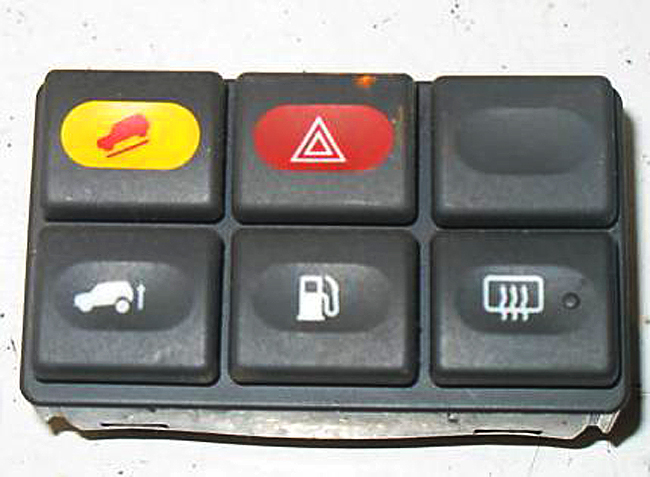
I'm not convinced it is that easy.
Cars traditionally have very generic button clusters, like [0]. It is even very common to have dummy buttons in there. Combine that with today's cars where those buttons are hooked up to some MCU to send a CAN message instead of being hardwired to a function-specific cable in a giant loom, and it is suddenly quite easy to change button functionality quite late in the design process for basically zero cost: you just need a slightly different label print and a small firmware patch!
Or, if you want to be 100% flexible, go with the ATM approach where physical buttons are placed next to an icon shown on a screen[1]. All of the flexibility and all of the tactile feedback! You can even go for a multi-level layout, with a top row of mode selection buttons, a bottom row of mode-specific function buttons, and perhaps even a big fat dial with haptic feedback[2]. Or even go all-out Elgato Stream Deck[3].
And sure, the fact that slapping in a giant touchscreen lets them decouple UX design from physical controls is going to play a big role. But it is by far the laziest and least user-friendly way of doing so. If that's the best you can come up with, you probably shouldn't be doing UX design at all.
[0]: https://www.classiccarstodayonline.com/wp-content/uploads/20...
[1]: https://media.istockphoto.com/id/672002868/vector/atm-machin...
[2]: https://www.youtube.com/watch?v=ip641WmY4pA
[3]: https://1.img-dpreview.com/files/p/E~TS940x788~articles/8521...
singleshot_
> if you want to connect, you have to make the magic work behind the screen.
What if you don't want to connect? What if you just want to go somewhere? Why would a car be tasked with connecting?
m_fayer
Might sound hyperbolic but this is clearly the softly smiling fascist menace of the corporate regime.
A gentle friendly assumption that we are all eager to partake in “euphemism for platform-serfdom”. Our desire to “connect/share/express/etc” is simply taken for granted.
And what if you just don’t want to? We’re sorry, but that’s simply not an option.
Forgeties79
All I hear is you hate connecting with people.
ErroneousBosh
People look at me like I've suddenly sprouted an extra head when I say this, but I don't want any screens in my car at all.
I don't even really want much of an instrument panel, because that's all distracting clutter and noise. I'm now of an age where I need reading glasses to see what the tiny 20x2 LCD screen it does have is saying, if it's not telling me what gear it's in and what the current odometer reading is - mostly today it's been lying about the gearbox overheating or the bonnet being open, such are the ways of 1990s cars - and if I've got my reading glasses on to see things inside the car clearly it means I cannot see things *outside* the car clearly, and the things outside the car are what I need to pay attention to.
So, no LCDs, please, I don't want any lit-up screens when I'm driving.
My car has a mechanical ignition switch that, when you put a key in and turn it, withdraws a big metal pin to unlock the steering and turns a small rotary switch. First click for the radio and other accessories, second click turns on the ignition, and the spring-loaded third click cranks over a beautifully simple engine that started life as a Mercury Marine inboard (and auxiliary engine, in larger vessels), and is still pretty much in production today in small quantities. Simple, and I like simple. No "keyless ignition" for crooks to relay and get the car started and drive off in it.
Nothing needs to connect to the outside world in it, and indeed its Atari ST-era computers would probably be baffled by it. It'd be like plonking a steam train engineer down in the cockpit of an A380, they wouldn't have a clue where to start.
I don't want a connected thing. I love driving. I don't want distractions. I write all my best code when I'm driving because there's no distractions. No-one is phoning me, I'm not doomscrolling Reddit or HN, there's no expectation except keep it oily side down and on the grey gravelly stuff, and out of the grassy stuff (well - at least until I get to the grassy stuff I actually *need* to drive on).
No screens for me please.
nottorp
> He also explained that "I'm a big believer in screens, because I really believe if you want to connect, you have to make the magic work behind the screen." '
I'd say he doesn't drive himself.
aenis
Likely.
What does this sentence even mean? "if you want to connect, you have to make the magic work behind the screen". It crashes my parser. Good thing I am not reading hacker news while driving :-)
mihaelm
I read it as finding a happy medium between analog and digital i.e. people will love the big screen if they still have physical buttons for all the functions they use often while driving. If you force them to fiddle around with touch screen for everything, they'll hate the big screen alltogether because the experience frustrates them.
mghackerlady
corpospeak for "we want to be a 'platform' but our software guys suck"
1980phipsi
And at the same time the car companies want to move away from Apple CarPlay, which for any of its fault is a substantially better UI than we can expect the legacy carmakers to produce.
Esophagus4
That’s all about money… they don’t want Apple to sell services to their customers when they believe it’s “their” territory.
Carmakers want SaaS revenue as well now.
trinix912
They just want to sell their navi map updates like they used to before CarPlay was a thing.
aenis
I used to drive a range rover sport that would display a long pop up with some legalese about focusing on the road while driving when I hit the navi button. It required acknowledging.
ragall
That wouldn't be a problem if it weren't that the built-in MB navigator is by ar the best I've ever used, and definitely better than all of the apps (Google Maps, Apple Maps, Waze, Nokia Maps, TomTom, Garmin, etc...).
Barbing
The low fuel, low wiper fluid, and forward collision warnings sound like they were all implemented a little clumsily.
What do you think the best implementation would look like? Seems it would still have to strike a balance. It's dangerous to tell the driver they're low on fuel if we distract them. But it's also dangerous for a driver to run out of fuel on the highway if we didn't catch their attention.
Also guessing you’re relatively detail oriented and don’t run out of gas, per:
“I don't want my car to draw my attention to itself for anything less than a critical engine/tyre pressure failures.”
The general public though… uh oh!
washingupliquid
> What do you think the best implementation would look like? Seems it would still have to strike a balance.
Somehow a small amber light (in the shape of a fuel pump) and a chime has worked for decades and there haven't been hordes of drivers stranded as a result. Something your grandmother could easily understand.
10-15 year old cars maybe give an additional small information message in the cluster easily dismissible with a steering wheel button.
No, the problem has been the mass importation of tech industry rejects into the car companies, as if the car companies haven't been quietly and successfully writing embedded software for 50 years, who brought their terrible habits with them. Like a need to "reinvent" UIs every six months.
Cars are safety-critical machines. They are not a place for "creatives" to experiment with UI design.
Sadly marketing drones think everybody wants a Tesla-style "everything is a screen" design whereas a 1999 Toyota pretty much had it right.
This isn't difficult. It requires no "innovation". Analog tach and speedo with idiot lights for critical alerts (there is literally an ISO standard for this) should be mandated by law. Substitute tach for a battery monitor in an EV.
EVs are the worst of both extremes. Either the entire interior is a touchscreen or you have something like the Slate, where there isn't even a radio. A room full of geniuses and what they come up with is a bluetooth speaker holder. Unbelievable, you can't throw in a DIN radio like a 1987 Datsun? Why can't EV manufacturers build a "normal" car?
weaksauce
> Sadly marketing drones think everybody wants a Tesla-style "everything is a screen" design whereas a 1999 Toyota pretty much had it right.
they also had to redesign the door handle and people have gotten stuck in the cars because of that and died. not just one isolated incident... more than one case of the car door not working because it's electrical only and the backup physical release mechanism is under a door panel you need to pop off and reach inside to pull after you just got into an accident and are physically disoriented.
ErroneousBosh
> Analog tach and speedo with idiot lights for critical alerts (there is literally an ISO standard for this) should be mandated by law. Substitute tach for a battery monitor in an EV.
You don't need a tacho. Some people add them in, like the Mini dashboard in the pic below, but they are absolutely not necessary. We managed fine without them for long enough.
https://treasuredcars.com/public/uploads/2019/10/22/mini_cla...
There you go, 1970 Mini, it's a 1275 version so it has an oil pressure gauge and an aftermarket rev counter.
Does your modern car actually *need* anything more exciting than that?
Compare these:
1982 Volvo, like I bought after I passed my driving test in the early 90s:
https://autopecas.norsider.pt/content/images/thumbs/136/1365...
2004 Range Rover P38A similar to the '97 I drive now although this is a NAS-spec cluster (like with the "unleaded fuel only" placard):
https://www.rangerovers.net/attachments/smartselect_20210517...
Notice something? Both have the fuel gauge, Volvo has a clock but posh models had a tacho, Rangie has a tacho, then both have the speedo, then the temperature gauge.
The Volvo has the idiot lights along the top, the Range Rover has them along the bottom - and in the middle a 20x2 LCD (which in that one looks a bit worse for wear) which shows the odometer, gear selection, and occasionally lies about fault conditions.
Doesn't it remind you a little of how aircraft have a standard "Six Pack" layout for the flight instruments?
We should do it this way.
mechanicalpulse
> a little clumsily
s/a little/very/;
> What do you think the best implementation would look like?
We already had one! Dashboard indicator lamps have been an international standard (ISO 2575) since 1982.
> But it's also dangerous for a driver to run out of fuel on the highway if we didn't catch their attention.
Yes, it is. But the key word is "if". The product folks involved in making these UI/UX decisions were more concerned with whether or not they could (read: "chimp attract" for "feature parity" to "drive sales") than with whether or not they should (read: "should we be manufacturing two ton death machines that act like nannies?"). Where is the research that provides the answers to the questions "how likely is it that the driver isn't aware of how much fuel is in the vehicle?", "are our customers really as stupid as we think they are?", or even "what's the downside of training our customers to accept a more mindless state of existence while piloting giant metallic flesh-tearing bone crushers packed full of explosive hydrocarbons and squishy humans?"
> The general public though… uh oh!
You can come down from your ivory tower at any time. We have tacos down here and we all enjoy them.
To quote the late, great Lou Holtz, "they put their pants on the same way we do". I don't think there's ever been a time in all of my years on this planet that I've gotten into a car to go on a highway journey of any length and not looked at the fuel gauge. Oftentimes, my passenger will even ask me how much gas is in the tank. Glancing at the fuel gauge should be the first thing that any motor vehicle operator looks at when climbing into the captain's chair. Maybe I'm at that stage of life where I'm no longer capable of comprehending the manner in which the younger generations experience the world, but getting into an automobile and driving off without knowing how much fuel you have is like walking out the front door without confirming that your shoe laces are tied.
This constant othering of "the general public" without any research to back it up really grinds my gears, to use a contextually appropriate idiom. Please stop.
Barbing
I wanted to acknowledge the user likely has above average faculties. “why would anyone use Dropbox,” “you can already build such a system yourself quite trivially by getting an FTP account, mounting it locally with curlftpfs, and then using SVN or CVS on the mounted filesystem”.
Zero times I’ve run out of gas. Don’t we pass someone walking with a gas can on the highway every year though? Dangerous, slightly safer if you use the fuel delivery service from AAA.
I admit I do not know quantitatively e.g. how popular that included-with-membership free 5 gallons (AAA).
Probably a million features I’d spend money on before trying to “fix” the fuel light though!
Barbing
Additional context:
Non-trivial for me to re-create dropbox.
I want a unique quiet ding when the gas light comes on and when I turn the car on with low gas.
Thank you for challenging me! Have to reflect.
NetMageSCW
I don’t look at the field guage when I get into the car and start it - I already know about how much fuel is in the car since I drove it last.
kshacker
> What do you think the best implementation would look like? Seems it would still have to strike a balance
Others have explained how the old tech worked well. But let's assume new tech (touch screens), and see what can be done.
There are urgent messages and non urgent messages.
Non urgent messages can be shown when starting the car and requiring the driver to acknowledge them. low wiper fluid - non urgent. This could be a list requiring ack for everything. Recently on my BMW they got the smog check year wrong, and it kept warning me for months before I realized I could change the date for the alerts - same should be possible for low fluid - Ok, I acknowledge, but stop warning for next 14 days (or 2 months).
Urgent messages have to be blocking.
Low gas would be non urgent when you have 50 miles of gas left, but could become semi-urgent (more prominent) when you have less than 50. Also, this is where the tech could be useful. If the car has internet and knows there are no gas stations within 50 miles, or whatever the current range is .... it should make it super prominent. That knowledge processing, aka AI in modern era, would be so awesome.
But it requires design for usability, not one catch all solution.
Barbing
You reminded me of a strategy I forgot - disabling features, like no cruise control when your check engine light is on.
Ekaros
I have never been especially bothered by fact that warning for low wiper fluid was well getting somewhat less wiper fluid... I don't use much, but it never felt like critical lack of proper early warning.
NetMageSCW
My car has only a small dashboard screen with some information and when something is alarming it is colored yellow or red for significance and pops up filling the screen, then after a little while minimizes to a little warning icon corresponding to the issue matching the color. Or I can hit a close button on the steering wheel.
red_admiral
Distinguish between what used to be red and amber lights.
hephaes7us
For years, vehicles have had a little light that comes on when you are below about 50 miles of range. It's next to the fuel gauge. I've always heard it called the "walk light", which I presume is a reference to the fact that, if you don't do something, you may have to start walking soon.
My car has a little screen in the dash where it usually shows my range, or the current temperature - information that I check when safe to do so, but never very urgently. This is the perfect place for a warning about low wiper fluid.
As for forward collision warnings, ehhhh. Maybe that should beep loudly, but it should almost never be wrong! (A false alarm could easily mean I slam on the brakes and get rear-ended, so that has to be balanced with the safety advantage of the true alarm.)
smugma
Forward and rear collision warnings have saved me several times in 3 different cars, including slamming on the brakes as I was backing up and then a MUNI bus that I didn’t see flew by.
I’ve also been in 4 accidents that were my fault (one on the same street, a MUNI bus blocked my view of another car that had the right of the way) and 2 that weren’t but I wasn’t able to avoid them.
I will always buy a new car with the latest tech because I acknowledge I’m a below average driver and those warnings (inc the subtle “someone is in your blind spot” light) are helpful to me.
PS I also prefer physical knobs (especially on the steering wheel) and don’t have cars with giant touchscreens.
Barbing
Glad I asked, y’all are great, thanks
ryandrake
> I am a big believer in keeping "product people" away from UI design for dangerous machinery.
I mean, there are product people who can do UI design for dangerous machinery. Put them back in charge. It seems like in the last decade, these product people were replaced with product people from Internet Attention-Monetizing companies and Gacha games, where you are rewarded if your product "attracted eyeballs" and "fueled engagement" and kept users hooked. These guys moved into car companies and are trying to do the same thing to drivers who are trying to navigate their cars at high speeds.
I think if I were a car company OEM trying to do it right, I'd look at every resume that came across my desk and if they ever worked for an internet software or game company, I'd chuck it in the trash.
aenis
Yes, you are right. All my power tools (from Makita, Milwuakee, Festool) have absolutely phenomenal UI - so there are still corners of industrial design where the dark patterns/attention grabbing product people haven't ventured. They should be brought back to car companies.
spockz
Power tools are getting Bluetooth now. I saw a Festool battery operated sander where you could set the settings for the light on it and more via the app on your phone.
b112
And I bet they were let go, when they tried to cite why all this change to no-buttons, attention-grabbing was wrong.
Upper management loves the "but everyone else is doing it" mentality, even if their mom would smack them aside the head for such logic.
red_admiral
Start suing car manufacturers for the deaths caused when the driver's eyeballs were distracted from the road.
spockz
For what it is worth, you can turn the pop-up to navigate to the closest fuel station off. In my XC90 MY16 it is called something “Suggest navigation on low fuel.” I will check it when back in the car.
pigbearpig
Yeah, where are they getting the customers that want the big screen?
Are these people stupid? These product people have lost touch with reality. I'm driving, I want to focus on the road, not a 39 x 6" touch screen.
rootusrootus
They're all copying Tesla. And ironically, only Tesla had a rational reason for their decision -- cost cutting. Not that I think the result is a net positive for the rest of us, it was ideal for Tesla. But just like the rest of their cost cutting choices they successfully spun it as a positive, and now other manufacturers are racing to copy them for all the wrong reasons. Though I suspect those manufacturers do secretly know the real reason and hope to benefit from it.
shcheklein
If they have custromer feedback and focus groups like they mention how did it happen in the first place? Some overoptimistic head-of-something? Really curious. I own previous -2021 mb and had to drive the upgrade (touch buttons) once as a replacement car. UX is terrible. Period. I even checked then in the dealership what they did to S-class and mybachs - and yes, same crappy wheel, etc. Anyways, I was mostly surprised that they didn’t know this before. Something is wrong with their research / decision making.
array_key_first
It could be the Pepsi sip test problem. Pepsi does well in sip testing, better than coke, but most people report liking coke better. Why? Pepsi is slightly sweeter, which means it tastes better for the first sip or two. But, in the long run, coke wins out because it's a bit less sweet and therefore more tolerable for a whole drink.
It's possible they tested touch screens with people using prototypes and whatnot but did not do their due diligence to test it long-term. On first impression, touch screens seem cool, futuristic, and flashy. It's really only when you try to daily drive the car that you realize they're annoying and a regression from physical buttons.
But, they present very well on sales room floors and car shows.
aurareturn
My guess is simpler. They didn't do much user study before going all screen. Tesla led the way.
Then, a few people inside Mercedes hated the idea and forced a study group to prove their point.
rsynnott
I bet if you showed a room of people a car with a big iPad thing a couple of decades ago, they'd ooh and ah, without necessarily thinking that deeply about what it would actually be like to use. Users are bad at knowing what they actually want on brief exposure; the thing that does well in focus groups may not be the thing that actually works.
ahartmetz
I guess it is possible that customers - the ones that they asked anyway - were also caught up in the touchscreen hype. There was a lot of hype in the first few years of iPhone and iPad.
binkHN
It's not hype; touch screens won for mobile devices and that's why they all work this way.
ahartmetz
Oh yes, there was an enormous hype. Things like tablets are going to displace all PC-type computers and such. I like to point out this article as an example of the mindless enthusiasm - I was rolling my eyes very hard at the time: https://www.techeblog.com/worlds-first-ipad-dj/
aurareturn
That was my first thought. How did they go all screen if they ran the study groups?
Spooky23
You don’t know what the group was presented and how.
Remember you have the stupid stuff that Tesla pushed hard during the peak Elon reality distortion field time. I regularly are in a Toyota, BMW and Honda, and all of these have well thought out touch/knob implementations.
ryandrake
It's pretty straightforward to structure and conduct a focus group to give you the feedback that you want to hear. If the money guys told you "touchscreens save us 1% on the BOM, make it happen," then you could design your demos and question wording to ensure that your report said "customers love this shit."
everdrive
>If they have custromer feedback and focus groups like they mention how did it happen in the first place?
This is part of the modern UI paradox. Never before has UI and UX gotten so much attention, and logging, and tracking, and research, etc. But of course with all that additional attention UI and UX is generally getting worse over time. I have my theories why, but I'd bet they're paying for decent talent here and are coming to the wrong conclusions.
mghackerlady
They aren't doing all that research to make their product better for you, they're doing it to make their product better for them. Those metrics help them design to keep you on [platform] for as long as possible, consuming as much [product] from [company] as possible. It benefits them to be easy to do the things they want (buy something or view ads) and hard to do things they don't want you to do (leave, change settings, generally take any kind of control)
iterateoften
focus groups are like the sobriety tests on the side of the road. Its just performance and the conclusion was made before it even started.
kotaKat
The Blackberry thumb trackpads in the steering wheels made me scream trying to navigate the dash menus.
... I cannot believe they actually put them in a base model Sprinter.
Do they hate tradespeople?
rconti
I'm looking at buying a used Porsche Macan. Through 2021 they were absolute button-fests, with a console absolutely littered with physical buttons.
In 2022, they moved to a piano black console with haptic "buttons". It also seems like there are somehow fewer of them; I'm not sure if more functions moved into the touchscreen or what.
Anyway, needless to say, I have no interest in the 2022+ with the haptics.
tim333
My 2010 merc is a button fest. About a hundred of the things and no touch screen.
dhorthy
functional programming taught us this decades ago. State is the root of all evil.
If the outcome of my interaction with the interface (e.g. tap a place on the screen) is a function of not just where i tap but the last 2-6 places i recently tapped (menus etc) suddenly you've added massive complexity and mental overhead.
can't wait to get back to a button that does the same thing every time every time i press it [1]
tesla screens, carplay, mercedes screens, its been getting worse for a while
1) I know in reality most are sliders or an on/off toggle but the point stands
gregorygoc
Currying is a thing in FP too.
danans
I personally find Chevy's recent infotainment control center great (Equinox/Blazer, maybe others too). Physical buttons with lots of travel (almost feel like an old IBM keyboard) for HVAC essentials, knobs for temperature and volume, and a big screen.
They have struck a really good balance between traditional interfaces and the benefits of screens.
hackerlytest
I really like what Jony Ive did with Ferrari. It’s the perfect blend of digital and analog instruments. High quality material and finishing.
Many of these German car companies are following what sells well in Chinese markets, more and more screens. IMO, nothing beats the feeling and assurance of tactile buttons/toggles/knobs.
cuu508
Fingers crossed the Chinese eventually figure out the screens are the mark of cheapness, and start demanding 100% physical controls.
bilbo0s
I'm a bit confused.
Were you aware there is actually a law in China requiring physical buttons?
I think from next year it applies to everyone. Not only Chinese makers.
What were the other physical controls you were thinking of?
tris_timb
Just commented the same thing! I loved the clock turning to a compass and screens being set back
dzhiurgis
It is really really good, loved it too.
But doing on a niche car is such a waste of development resources (as all Ferraris are of course). Or maybe given this is going to be EV perhaps Ferrari is finally planning mass manufactured car, but I doubt.
Get the top HN stories in your inbox every day.
I’m quite suspicious that they do that not because they understood or learned something, but because China requires physical buttons starting next year. And they simply don’t want to lose one of their biggest markets.