Get the top HN stories in your inbox every day.
doe_eyes
pminimax
Author here, yes, it tests a mix of your monitor calibration and colour naming. The two types of inferences you can make with this are:
1. If two people take the test with the same device, in the same lighting (e.g. in the same room), their relative thresholds should be fairly stable. 2. If you average over large populations, you can estimate population thresholds, marginalizing over monitor calibrations.
The most interesting thing for me is that while cyan (#00ffff) is nominally halfway between blue and green, most people's thresholds, averaged over monitor calibrations, imply that cyan is classified as blue. I was not expecting that the median threshold (hue 174) would be so deep into the greens.
egypturnash
I got hue 174 as my threshold and really I just wanted to say "neither, this is turquoise/teal" for most of the questions. But blue/green was the only option.
soulofmischief
I got hue 175. It's interesting to note that some older cultures, Japan for example, didn't always have separate words for blue and green, both were the same color ("ao" in Japanese). You can see the effects of this even today with things like traffic lights in Japan, which are considered "green" by their standards but blue by many others' standards.
There are also other cultures, such as Russia, where light blue / dark blue (simplification) are effectively considered separate colors.
All this to say, personally, I think we will continue to evolve to recognize more distinct "colors" such as teal, which is neither blue nor green but somewhere between. A lot of this recognition power is rooted in linguistics and culture, it's not as strictly biological as one might think.
hammock
The point is to determine whether turquoise to you is more green, or more blue.
riffraff
Fun, I got 174 and when I saw the results my reaction was "but that is not turquoise!" which I suppose means I either don't know what turquoise is, or my screen has bad calibration/gamut.
hammock
Here is a chart of HN reader results, based on two pages of comments: https://i.imgur.com/tIQfTjN.png
Mean is 176 Median is 175 Mode is 174
wodenokoto
Me too, but I liked the conclusion ("to you, turquoise is blue/green")
bryanrasmussen
it looks like my default is if there is 40% green in that it is green. Thus it told me that turquoise for me is green. Which if I look at Turquoise the RGB color, that is green. If I look at Turquoise the mineral about half the time it is green and half the time blue.
Tor3
Same thinking here, though I got 184
plorkyeran
Same, my answer was “neither” after the third color so I just alternated between blue and green until it stopped.
ddejohn
I'd love a last step in the test where you're presented with the gradient, but before showing the distribution and the user's score. Allow the user to select where they consider their threshold, then display the final results.
rsyring
I really wanted to be able to drag my vertical bar on the distribution to the right just a bit. :)
When I could see the entire gradient, I actually thought green continued to the right a bit more than where my line was.
pminimax
That's fun! I bet people would tend to nudge the threshold toward the middle of the scale. Or you could do a sorting interface, etc.
aaomidi
Thats genius
codeflo
> The most interesting thing for me is that while cyan (#00ffff) is nominally halfway between blue and green, most people's thresholds, averaged over monitor calibrations, imply that cyan is classified as blue.
Perceptually (that is, in CIE-LCh color space, for example), the hue component of #00ffff is a lot cloer to #00ff00 than it is to #0000ff. But the website doesn't ask which color is closer, it asks if it's "green" or "blue". And how we use those words has more to do with culture than with perception. We also call the color of a clear afternoon sky "blue", even though that is perceptually extremely far away from #0000ff.
blahedo
> while cyan (#00ffff) is nominally halfway between blue and green, most people's thresholds, averaged over monitor calibrations, imply that cyan is classified as blue
Yes, because (at least for me) the thought went "well that's cyan, it's not really blue but if forced to pick, cyan is more like blue so I'll click that". It's like rounding up at 0.5.
Tor3
For me it was like "if forced to pick, cyan is more like green". So I kept clicking green and got 184.
lupire
In USA:
Primary Additive Colors: Red, Green, Blue
Primary Subtractive Colors: Cyan, Magenta, Yellow
But, before digital color displays became popular, the average person had, by far, mostly exposure to subtractive (paint) colors.
US school children are taught from birth that the primary subtractive colors are red, yellow, and blue, simply because those words are easier to pronounce, and so magenta is a weird "red" and cyan is a weird "blue" , until the children discover on their own, or in specialized print/paint schools, red and blue are not primary subtractive colors.
Humans are terrible at naming things.
And to bring it back to Current Thing: Google AI cites this source for its red/yellow/blue claim, even though explicitly this source says that Google gives the wrong answer.
https://science.howstuffworks.com/primary-colors.htm#:~:text....
Will GenAI's aggressive ignorance kill sarcasm and nuance in writing? Or will people learn to ignore AI input like they ignore banner ads?
Jaxan
I refuse to call cyan either blue or green. It’s clearly in between.
Just like I would never call orange yellow or red.
naijaboiler
I refuse to call cyan cyan. I just call it blue-green
nobrains
primary: yellow, red, blue
secondary: green, orange
cyan: not primary nor secondary.
i hope that helps.
jacobolus
By the way, "cyan" is a very poor name to use for #00ffff. The term "cyan" refers to the kind of slightly greenish blue used in 4-color printing (CMYK), and was just a Greek word for "blue" chosen to be a jargon word to avoid confusion with the English color name. It has a totally different color than the equal mixture of typical G and B primaries in a computer display.
Similarly, "magenta" is a poor name to use for #ff00ff. The term "magenta" is a jargon word for the slightly purplish printer's red, which was chosen to avoid confusion with the English word "red". It has a completely different than the equal mix of RGB R and B primaries.
("Red", "green", and "blue" are also very poor names for the RGB primaries, which are substantially orangish red, yellowish green, and purplish blue.)
tgsovlerkhgsel
I'd check whether there are biases depending on which color you start with / which colors you present when.
lloeki
Ambient light will also affect the result.
Not necessarily because the ambient light would affect the screen shows (it's emissive, not reflective) but because the brain also does "auto white/colour balance".
For a fun experiment, get your hand on some heavily yellow-tinted party glasses, go outside on a clear day with a bright blue sky.
When you put them on everything will be stark yellow tinged (and the blue sky will be completely off, like green or pink, can't recall which) but after a little while going on your business, perception adjusts and only a much less dramatic yellowish veil is in effect. You'd look at the sky and see almost-blue.
The kicker is when you remove the glasses: the sky will suddenly be of a glorious pink! (or green, can't recall) Only moments later it'll adjust back to be blue.
A certain wavelength may be absolute blue of a certain kind, but the perceptual system is all relative: "wait, I know this sky should be blue because that's what I've always seen, so let's compensate".
The same kind of effect - although less dramatic - can be achieved with lights that can be adjusted from say 2400K to 6500K and having as reference an object that is known "pure white", like a A4/letter sheet of paper.
This effect, in turn, adjusts how "absolutely displayed" colours are identified by way of biasing the whole perceptive system. AIUI that's the rationale behind Apple's True Tone thingy, aiming to compensate for that.
So the result of this test should be somewhat different depending on ambient lighting temperature.
cubefox
Digital cameras also do automatic white balance (between yellow and blue) to mimic the automatic white balance of our eye/brain. If cameras didn't do white balance, outdoor photos with sunlight during noon would look extremely blueish, or indoor photos with artificial light would look extremely yellowish.
I like this illustration of how strong our natural white balance is:
https://en.wikipedia.org/wiki/The_dress#/media/File%3AWikipe...
MereInterest
During some heavy dust clouds from nearby wildfires, the sky was a deep and unsettling yellow. However, I couldn’t get a picture of it, because the automatic color balance removed the yellow overcast altogether.
cubefox
> AIUI that's the rationale behind Apple's True Tone thingy, aiming to compensate for that.
No idea what "AUIU" is, but yes, generally displays should do automatic white balance like iPhones do. I don't know why most Android phones don't seem to do it (pretty sure mine doesn't), and generally TVs/monitors also don't do it. (The required color temperature sensor can't be that expensive?)
lloeki
> I don't know why most Android phones don't seem to do it (pretty sure mine doesn't), and generally TVs/monitors also don't do it.
The rageguy one would say either patents or "whoa the colors really pop I want that shut up here's my $$$" uncancellable LOOKATMEIAMTHESHINY mall mode, but via Occam'r razor I think mostly because they (manufacturers) simply don't care (about consumers, or about making a good product at all)
TVs/monitors (or laptops even, and more phones that you'd believe) with just a simple auto-brightness are stupendously rare even though Apple does it since forever and a half ago.
nkrisc
AIUI as I understand it
dotancohen
> Ambient light will also affect the result.
i_am_a_peasant
Also my glasses filter blue light.
ChrisMarshallNY
This is pretty much the same way that a calibrator works (if you have ever watched a color calibrator running, you know what I mean), but a calibrator doesn't get biased, like the human eye.
In order for it to be a true "neutral" test, each test would need to be preceded by a "palate-cleanser" gray screen, or something, and there would probably need to be a neutral border.
> you should be shown all hues at once and asked to position a cut-off point.
This is actually the way I have seen this stuff tested, before.
sandworm101
These sorts of tests also need to be done in controlled background lighting. Whether people are doing this in a dark room, in a sunny kitchen, or under green led lighting would be a greater factor than anything being tested.
TuringNYC
>> These sorts of tests also need to be done in controlled background lighting. Whether people are doing this in a dark room, in a sunny kitchen, or under green led lighting would be a greater factor than anything being tested.
Whether its a dark room or sunny kitchen, i'm not sure whether Turquoise is ever going to be blue or green. The entire question seems more like wordplay.
AlotOfReading
I don't think that's necessary for an informal test. Human color perception is extremely good at compensating for that and modern screens are relatively uniform and uniform besides. Cultural differences like the person downthread saying they consider anything with the slightest hint of green to be "green" seem far more impactful.
trebligdivad
I tried it twice, once on each of my two different monitors (a Dell S2817Q and Dell S2409W) made a few years apart and with completely different settings; and I got 175 on one and 174 on the other. So pretty close even given the difference.
krick
I mean, it really just tests arbitrary word usage. I have no fucking clue if turquoise is supposed to be "green" or "blue", it's turquoise!
langcss
A bit like "is this hotdog overpriced" amd trying to binary search the exact cent where it became overpriced.
Bluecobra
That’s easy, any hot dog that is more than $1.50 USD is overpriced.
mrweasel
That might be a language issue. In Danish it's common to use "turkis blå", i.e. turquoise blue. Then again, you can also use "turkis grøn", turquoise green.
mewpmewp2
But with green/blue there is certain opinion that I have at least.
ibash
Nah turquoise is green.
ninetyninenine
No turquoise is blue.
MathMonkeyMan
Apparently I thought so as well. Then again, my display is in night mode...
hypertele-Xii
Turquoise is dark cyan, no? So equal parts green and blue.
arcxi
the real question is whether orange is red or yellow
chimeracoder
> To address that last problem, I think the color display area should be much smaller, or you should be shown all hues at once and asked to position a cut-off point.
If you're doing this on a phone, try holding your phone at arm's length and against a white background (such as the wall or ceiling) and doing the test that way. Assuming you have redshift/night mode disabled, I suspect you'll end up closer to the median.
Izkata
> I suspect it tests your monitor and monitor calibration as much as your color perception. In particular, sRGB displays have a pretty severely limited green gamut. If you have a wide-gamut display, the test is probably gonna appear different.
Also browser choice: https://issues.chromium.org/issues/40401125
undefined
fogleman
I think this is flawed. You quickly end up on a color that's clearly not "blue" or "green" and you're unlikely to keep hitting "this is green" several times in a row, conceding that ok, fine, maybe this is blue, whatever. You're basically measuring how many times people are willing to click the same button in a row.
Edit: Possible improvements: changing the wording to "this is MORE green" and "this is MORE blue" and randomizing the order in which they are shown, somehow. I realize you're just doing some kind of binary search, narrowing the color range.
This is not to mention color calibration of your monitor, or your eyes adjusting / fatiguing to the bold color over time...
pminimax
The order is randomized. Hit reset and you'll get a different sequence. The sequence is also adaptive (not a binary search---it's hitting specific points of the tail of a sigmoid in a logistic regression it's building as you go along). Try it a few times and you'll see how reproducible it is for you.
It of course depends on the calibration of your monitor. One of the reasons I did this project is I wanted to see if there were systematic differences in color names and balance in the wild, for example, by device type (desktop vs. Android vs. iPhone), time of day (night mode), country (Sapir-Whorf), etc.
lifthrasiir
The sequence itself should be converging however, right? I feel that there should be some random jumps outside of the current confidence interval so that contextual aspects can be filtered out or at least recognized.
isoprophlex
Yes, exactly this. Because it seems to be converging right now, I quickly get the feeling that there's no meaningful choice, after the first three prompts you end up with something that's neither green nor blue. Re-taking the test gave me a very different score.
It might work better for me to do some contrastive questioning: show a definite green followed by an intermediary color, then a definite blue followed by an intermediate color.
Rastonbury
These results would be interesting
yarg
I'd prefer blue/green/neither.
With the third colour, I just thought "no, that's teal", and my decision was (as you suggested) semi-arbitrary.
pminimax
It is common practice in psychometrics to use two levels in a forced choice and model responses as a logistic regression, which is what's done here. Adding an N/A option turns the thing into an ordered logistic regression with unknown levels, which is tricky to fit, but it's possible. Having done a lot of psychophysics, having more options generally doesn't make the task easier.
bofadeez
Sounds like psychometrics is unsuitable for modeling this problem, according to what you're saying. When you have a hammer everything looks like a nail.
zarzavat
The way that XKCD did it is the best, you ask people to give a name to each color then the responses are entirely natural and unprompted.
I don’t think that forced choice can give accurate results if a substantial number of people perceive green and blue as being non-adjacent - i.e. there exists a color between green and blue (turquoise/cyan/teal).
Otherwise it’s like asking people whether a color is red or yellow, when it’s clearly a shade of orange.
EasyMark
That’s why I took the test 5 times, and my scores varied between 63% and 69% “green” so I took the average at 66.4
tripzilch
Are you sure that it is common practice for a problem that has three valid answers A, B and C, to only allow people to answer A or C?
Your website is not talking about "levels" of colour.
It's asking "is this blue or green", not "is this closer to blue or closer to green".
The question (1) "is this blue or green" has three valid answers: blue, green or neither.
The question (2) "is this closer to blue or green" only has two valid answers.
I would assume that with these types of surveys, the first thing to do is to qualify the proper categorization of the question.
Sorry to say, but to me it seems that almost all of the confusion in the discussion here is because you're asking question (1) (which has three valid answers) but expecting an answer from (2) (which indeed has two valid answers).
adamhartenz
but is the teal more green or blue. You should be able to answer that
yarg
Is zero more positive or negative? You should be able to answer that.
Narishma
It's more teal.
antisthenes
Nope. On RGB, they are equal parts blue/green.
Since most people are viewing this on a monitor, the question is pointless.
dyauspitr
Then everything past the first blue would be neither and you wouldn’t have anything interesting. All those other colors are different shades of teal.
elcomet
But this choice has very limited impact; as you are already in a very narrow window of color
Al-Khwarizmi
I definitely have the bias you mention. In my case I don't think it's mainly due to not wanting to push the same button many times in a row, but because I compare with the previous color, so if previously I was already somewhat unsure but I chose green and now it became slightly bluer, it "must" be blue, right?
I think I can get over it, but it requires conscious effort and even then, who knows. Bias is often unconscious.
Another possible improvement would be to alternate the binary search colors with some randomly-generated hues. Even if those answers are outright ignored, and the process becomes longer, I think they would help to alleviate that bias. At least you wouldn't be directly comparing to the previous color.
KaiserPro
VFX engineer here. Yes we used to cailbrate monitors and work in the dark.
However one of the key people that built our colour pipeline was also colour blind, so its not actually a requirement, so long as you use the right tools.
Most people aren't that sensitive to colour, especially if its out of context. a minority of people aren't that good at relative chromaticity as well (as in is this colour bluer/greener/redder than that one) But a lot of people are.
Language affects how you perceive colour as well.
But to say the experiment is flawed I think misses the nuance, which is capturing how people see colour _in the real world_. Sure some people will have truetone on, or some other daily colour balance fiddling. But thats still how people see the world as it is, rather than in isolation.
MisterBastahrd
I once worked for a company that had a designer who was color blind. He would always show up wearing the exact same outfit every day: turns out that he was REALLY color blind, and so he just gave up and bought 7 long sleeved shirts and 7 pants, all black. Didn't work out so well for him in the designs... most companies don't want monochrome websites.
tptacek
One issue with it: I did it 3 times and got 3 very different results.
Retr0id
Likewise. I think for me there's quite a wide band of colours in the middle that I consider to be "neither/either", so I'm basically just picking a random answer for those.
A modified version of the test that finds two boundaries (green/neither/blue) could be interesting.
Or maybe it just needs to take more samples, in a more random order.
wzdd
Same. Some of them are neither obviously blue nor obviously green, so what the test was measuring for me was what I was thinking about at the time, the decision I'd previously made, whether my mouse was currently hovering over "blue" or "green", etc.
fsckboy
>I think this is flawed. You quickly end up on a color that's clearly not "blue" or "green" and you're unlikely to keep hitting "this is green" several times in a row, conceding that ok, fine, maybe this is blue, whatever.
I agree with you, the whole thing is flawed when it could be better. When you ask the question "is my blue your blue?", you are evoking the old philosophical question, and it's a question about color perception, not words. This test did not test color perception, it tested "what word do you use?"
I think of blue as a pure color, and green as a wide range of colors all the way to yellow, to me another pure color. so if there's any green at all in it, I'm going to call it green. (maybe it's left over from kindergarten blending "primary colors". also, while I like green grass, I don't like green as a color, so any green I see is a likely to make me think, ew, green) But in terms of what I see, I can only assume I'm seeing the same thing as everybody else is because the test is not testing it. Just because I call something green doesn't mean I don't see all the blue in it.
>Edit: Possible improvements: changing the wording to "this is MORE green" and "this is MORE blue" and randomizing the order in which they are shown, somehow. I realize you're just doing some kind of binary search, narrowing the color range.
yes, the test should show you pure blue, then a turquoise mix, then pure green, and a ... etc. It should also retest you on things you already answered to measure where you are consistent.
yarg
I do think that the philosophical question could potentially be approachable in a modern context;
Show people a colour and map their brain activity - the level of similarity between two people's colour perceptions should be reflected by similarities in the activity.
pminimax
People have done this. See, e.g. Brouwer and Heeger (2009), Decoding and Reconstructing Color from Responses in Human Visual Cortex.
lazide
Why do you think that would be the case?
One persons ‘blue’ activity could be different than another’s while still being the same wavelength of light and general perception.
yread
Agreed. It would be more accurate to show the final gradient (without the curve) and let people choose where is the boundary. It wasn't even clear what the actual task is
adamhartenz
Yup, but at that level, you are not affecting the results very much. So it all works out
pminimax
Author here. I added fields so you can specify your first language (relevant link: https://en.wikipedia.org/wiki/Blue%E2%80%93green_distinction...) and colorblindness.
FAQ:
* I can't know your monitor's calibration, your ambient light, or your phone's brightness. Obviously, this will affect the results. However, I am tracking local time of day and device type, from which we should be able to infer whether night mode and default calibration has any aggregate effects. Anecdotally, thus far, I haven't found any effects of Android vs. iPhone (N=34,000).
* The order is randomized. Where you start from can influence the outcome, but methodologically it's better to randomize so the aggregate results average over starting point. You can run the test several times to see how reliable this is for you.
* It's common practice in psychophysics to use two alternatives rather than three (e.g. blue, green, something in the middle). It would be a fun extension, which you can handle with an ordered logistic regression. The code is open if you want to take a shot at it: https://github.com/patrickmineault/ismyblue
* I will release aggregate results on my blog, https://neuroai.science
* I am aware of most of the limitations of this test. I have run psychophysics experiments in a lab on calibrated CRTs during my PhD in visual neuroscience. *This is just entertainment*. I did this project to see if I could make a fun webapp in Vue.js using Claude Sonnet, and later cursor, given that I am not highly proficient in modern webdev. A secondary point was to engage people in vision science and get them to talk and think about perception and language. I think it worked!
scottdupoy
My partner and I regularly disagree on blue vs green as the colours become more of a gray colour - might be interesting to randomise the brightness of the colours being displayed then seeing if the skew towards people perceiving blue Vs green changes as the colours become closer to gray.
MayeulC
I also often disagree on blue vs purple, which is inconvenient when we name the same coat two different colors.
I think my "blue" is a way more specific shade than most people (hue 192 here, whatever that means on an uncalibrated display). Likewise, I'll usually say "purple" before others.
Normal_gaussian
This is a fantastic site.
My partner and I were well aware of the limitations, but it has clearly demonstrated our difference in perceptions in a way we were both happy with. Being able to see where your partner lands relative to you is deeply satisfying.
KajMagnus
It was fun but I messed up the statistics! I had Redshift running, which (maybe you know) makes the colors more reddish. And I got a bluer than 98% of the population result. Turning off Redshift ... makes me instead greener than bluer.
pminimax
I wouldn't worry about one datapoint out of 35,000 messing up the stats.
KajMagnus
That's a lot! Now I noticed: "I am tracking local time of day[...] infer whether night mode [...] any aggregate effects."
So you've thought about that already :- ) (it's evening here)
Moru
I would guess the hackernews crowd has a higher percent of bluefilter installs since that is a very common topic. Probably also more agressive settings for the blue filter.
beezle
When done on my Xperia cell phone, even a small shift in screen orientation made the green leaners into obviously blue. Might be worthwhile capturing phone position if you can.
kazinator
I stopped at the first one I could not call blue or green.
If I were to call it blue or green, it would not only not be reflecting what I think, but I could not guarantee that if I'm show the exact same color again, that I will go the same way. So I felt there was no point in continuing.
This is a problem in the method; there needs to be a third choice, so that the user can always answer (at least if the test color is always in the blue-green gamut).
It could work with two choices if the user were instructed to randomly choose in the event of indecision. I mean, truly randomly, like by means of a fair coin toss. But that could just be implemented for them by a third button. That button could then just record their indecision rather than randomly choose between blue and green, so you have better data.
Without a third choice, or properly randomized behavior, you have bias problems. For instance, a certain user who likes the blue color might always say blue when not able to decide. Another one might always go for green. Yet, those two users might exactly coincide in what they unmistakably call blue, green and what triggers hesitation/indecision.
(I realize that no matter how many bins we have, there are boundary indecisions, like not being able to decide between green and blue-green. What range constitutes indecision is also subjective.)
rotidder
That exactly is the point of the test though. Not to test whether most people call 100% blue blue, or 100% green green. It is to test at which point of the "inbetween" colors people switch from blue to green or vice versa. It forces you to decide whether the color you see is "more blue" or "more green", since after all they're all just a mix of blue and green.
Timwi
Well for me, personally, blue and green are simply not adjacent, so there's no point where green turns to blue without going through an intermediate color. This might well be due to my extreme exposure to computer colors, where the in-between color is usually called cyan, or sometimes teal or aqua. When I see cyan, I cannot sincerely say that it looks “more blue” or “more green” to me, any more than an orange tastes “more apple” or “more banana”.
ertgbnm
Light can absolutely be more blue or more green in an objective sense. Either it is closer to blue on the spectrum or it's closer to green. It doesn't matter if you have intermediate categories in between.
To poke a whole in your analogy, a more apt comparison would be to a gradient of sweetness, where one can indeed describe a flavor as "more sweet" or "less sweet" relative to apples and bananas.
kazinator
I suspect that if you were shown two blue-green colors side by side, with nothing between them, you could look at the boundary and tell which side contains more blue.
kazinator
You can estimate that if you can determine at which point the color becomes too ambiguous to call blue on one side, or green on the other. Different people will have a different range. If you want to identify a threshold, you can take the midpoint of the range.
Either of these approaches may be bad. The third paragraph of this page explains why:
https://en.wikipedia.org/wiki/Two-alternative_forced_choice
My suggested approach might not be much better though; it still relies on presenting a single stimulus.
It's not clear how the two-alternative forced choice can be used to find someone's blue-green threshold.
I think a better experiment would be to show the user gradients and ask them to move a bar to where they think is the midpoint in the blue-green transition. Subsequent gradients center on the user's previously identified midpoint, but zoom in more.
There is also this question: by which path do we interpolate from blue to green?
Let's imagine the CIELAB color space. Say that our pure green lies on the red-green axis, all the way on the green end. Blue lies on the extreme of blue-yellow. Do we interpolate through these linearly or what? And using what luminance value?
I suspect that for every given, fixed luminance value, the blue-green boundary is a contour. There are many paths we can take between blue and green, and along each path there is a boundary point. If we join those points we get this contour. Then if we do that for different luminance values, the contour becomes a 3D surface in the color space.
Narishma
In my case, and it seems OP's as well, it forced me to stop the test instead of picking one of the two.
phito
Totally agree, I stopped at the second one because it was neither green nor blue
marcus_holmes
I'm red/green colourblind, so this was interesting to compare my green against my blue.
The thing I find being colourblind is that I value colour less than shade. Colour signals, even when I can tell them apart, are just less important to me than to non-colourblind people.
I most recently noticed this playing Valheim with my wife. There are red mushrooms in the game, surrounded by green foliage. I noticed that I have trouble spotting them, even though I have no problem seeing that they are red and the foliage is green. To her, the mushrooms stand out as being very visually different from the background and immediately noticeable. To me, they just aren't that distinct and get quite hard to spot.
So while I got the green/blue distinction to within 80% of the population, despite my shitty colour perception, it just didn't matter. At some point in the process I got to "I really don't care. I would ignore the signal that any further difference in colour is sending".
As you can guess, I have fascinating talks with designers and artists, to whom the differences really matter. I understand that colour is really important to them. I just don't see it.
mihaaly
I am also red/green colorblind and so I cannot tell if graphs using colours in many articles (more than not) is so shitty for everyone else or not, but choosing no distinct colours (that I have no trouble differentiating) on thin lines is defying the purpose (understanding) I believe. Even if I had no trouble with colours (being close to darker shades of brown) I would perhaps use thicker lines and variate the style of the lines. So the information screams out. Putting similar shade colours on graph with colour legend in the corner telling which thin line means what is just something I throw away mentally being so difficult to navigate.
karaterobot
I've got normal color vision, and it's bad for me too. If there's more than about a half dozen lines on a graph, chances are two of them are going to be so close together that it's a pain to figure out which is which. Visually distinguishing information in graphs can be a very tricky problem, but at the same time, people could easily do a much better job at it if they tried.
thisOtterBeGood
Interesting. Red next to green creates a different kind of contrast. It looks like its glowing (vibrant border), the same way our eyes perceive something very close compared to something far away. That is just my observation, I'm not sure If there is some scientific evidence for that.
lll-o-lll
I have normal color vision, and color just doesn’t matter to me (I can never remember the colors of things, and distinction by color doesn’t help me much). I’m not discounting your theory, but I think there must be a little more to it.
AlotOfReading
Not the person you're responding to, but also colorblind and I strongly relate to what they're expressing. It's different than not being able to remember colors. I can see (most) differences, but I need to actively focus on seeing to do it. For example, one CI system uses red/green stoplight emojis for test status. A given run might have 50-100 of them. Trying to see which ones are red means actively looking at each individual status and thinking "what color is that?" because my brain simply doesn't register reds as "jumping out" in the sea of green.
Suppafly
>For example, one CI system uses red/green stoplight emojis for test status. A given run might have 50-100 of them. Trying to see which ones are red means actively looking at each individual status and thinking "what color is that?" because my brain simply doesn't register reds as "jumping out" in the sea of green.
Fellow CVD person here, I have that same problem at work. That and when there are up/down arrows and whether up or down is good changes based on the metric and they use color to let you know. They all look samey unless I actually stare at them for a while and the color difference sorta bubbles up.
It's so annoying too because it'd be trivial to use different signals instead of color, but no one cares about the 1/12 of us that are colorblind. It's crazy that the ADA doesn't recognize CVD as needing accommodation when it's far more common than most other disabilities.
marcus_holmes
Yes! I've had some lengthy discussions with UI designers trying to get them to understand this exact point. I can see that they're red and green, I just don't notice that they're red and green.
Finnucane
I got 174 ('true neutral') by choosing 'blue' or 'not blue'. The 'green' here looks to me like a light yellowy-orange. The color that I have learned to associate with unripe bananas.
joegibbs
I got "Your boundary is at hue 167, greener than 86% of the population. For you, turquoise is blue". I think I consider darker and yellower colours as green - for instance tennis balls are firmly green to me, but a lot of people say they're yellow.
I wonder if this has anything to do with your upbringing. I grew up on a farm in a dry part of Australia, where the grass didn't often get very green. Most of the year it was yellow. If you associate green with grass and the grass is yellow, maybe you associate green with a yellower colour?
Jeremy1026
It's very cultural. For example, Japan used the same word for green and blue, so their green light on traffic lights is as blue as possible while conforming to international standards for the light to be "green".
Also, there is a pretty well done video by Vox on how color names are influenced by culture https://www.youtube.com/watch?v=gMqZR3pqMjg
numpad0
I think this might be a bit overblown. "why do we call it blue signal?" is a common 3-5 years old question in Japan.
Old Japanese traffic signals had blue tinted lenses, like ultramarine blue. Those lenses were used in conjunction with warm yellow incandescent lamps, technology available at the time. Deep blue + warm yellow = green.
Over time the green color must have normalized, without laws and slogans not reflecting that. And nowadays they're green LEDs.
dhosek
The blue-green distinction is something that tends to come late in most or maybe all language families. Ancient Greek also used the same word for blue and green. As I recall, the first color words a language gains are black and white, followed by red. Blue-green is one of the last distinctions made.
petercooper
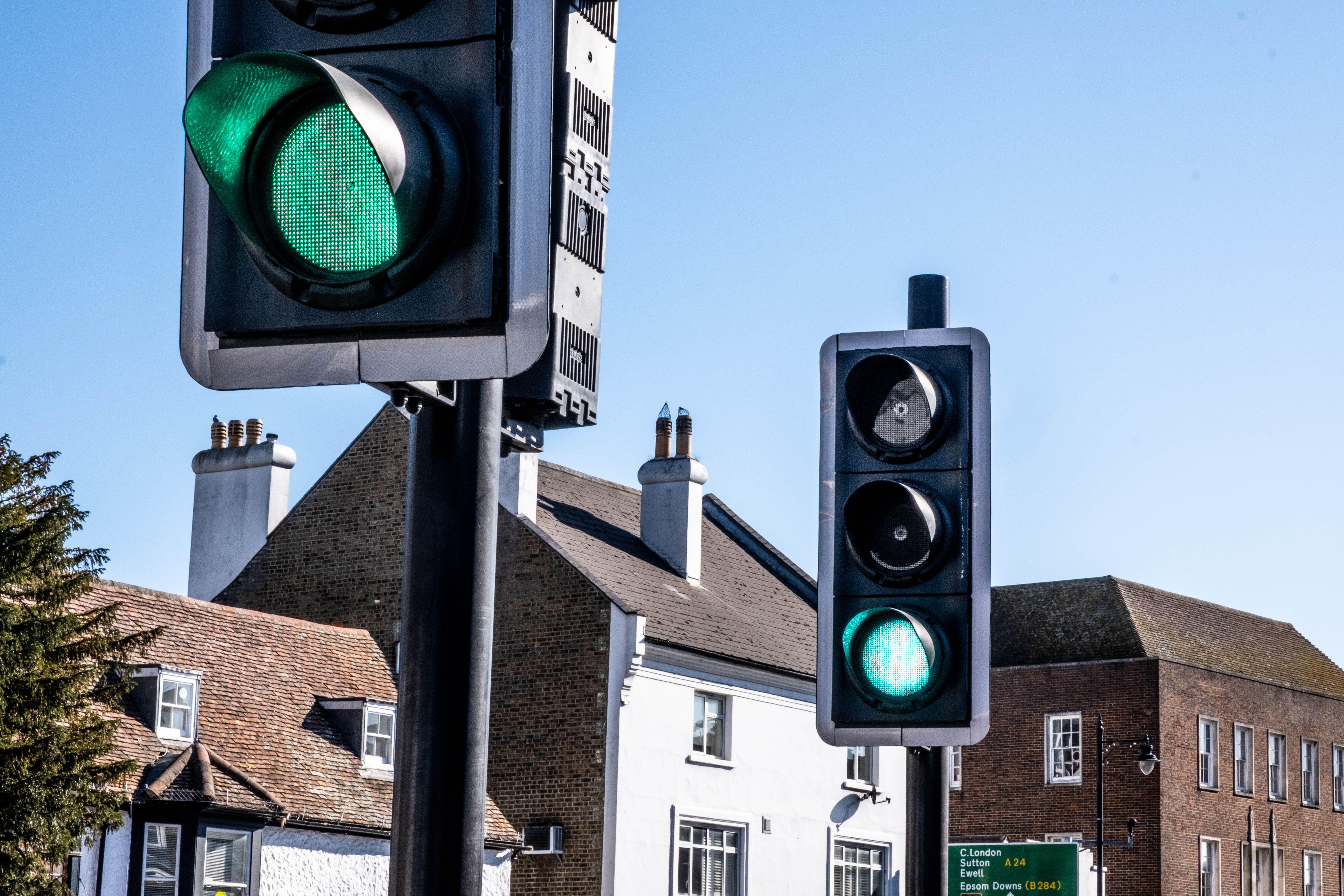
This has begun to happen in the UK as well, and I'm struggling to get anyone else to see it. Traffic lights installed in the past couple of years seem to use a new style of LED that emits a turquoise light instead of green. I took a picture and looked at the RGB value and the G/B were equal. Everyone else I ask says they still look green. Here's an example: https://static.independent.co.uk/2022/04/22/00/21135757-1ac1...
arrowsmith
Not just Japanese - many languages use the same word for "green" and "blue". Linguists call it "grue".
https://en.wikipedia.org/wiki/Blue%E2%80%93green_distinction...
E.g. the Vietnamese word xanh means "grue", and to distinguish between green and blue you say "sky xanh" or "leaf xany".
WesolyKubeczek
Thank gods at least red is red.
In all rulebooks, lights are red-yellow-green, but in many places, I can see red-amber-turquoise. Now a sure way to get a traffic police officer livid is to call the yellow light “amber” or “orange”…
pests
My friend got a "Running an Amber" ticket when we were teens outside metro Detroit, MI. I had never heard it called that color before but that small memory is always on my mind when the light changes as I'm crossing.
azepoi
It's orange in french
epiccoleman
I got a very high "green" threshold too - 95% averaged across three runs, since my first result seemed surprisingly high.
It's funny though - I feel like I'm less likely to go green on the other direction too. I'd probably say a tennis ball is right on the line, and seems more yellow than green to me too.
Maybe I'm some sort of green gatekeeper, and I don't want to dilute my personal definition with lesser greens. Green is my favorite color, I'd say, so maybe that's something to do with it.
azepoi
It can be cultural. Turquoise is often called bleu turquoise in french. So it's more of a blue to me.
seszett
Yes, and I'd like to see a breakdown of the answers per country.
I'm French and my boundary is at 167 apparently (though I have a poor screen and depending on where I look, I could say that even further towards the green side is still blue). But a regular occurrence at home is my wife (who speaks a different language, we don't live in France) talking about « the green table » while I'm trying hard to find any green table around us, until I realize she's talking about that turquoise table that I call the blue table. Also happens on the red/pink and pink/purple boundaries.
warpech
Agree. If the author collects the IP address of the response, maybe countries can be mapped retrospectively.
Sateeshm
My boundary was at 89%
jade-cat
I've taken the test multiple times, and ended up with my boundary being both greener than >70% of the population and bluer than >70% of the population in separate attempts. And I know my color perception to be good at distinguishing hue - it's just that I don't have strong opinions about categorizing it in this space.
I'm pretty sure there's some hysteresis going on - if we randomly end up in the ambiguous zone on the bluer side, we'll be pressing "blue" every time a small change happens, because it's basically the same color. Until the changes add up so much that we're out of the ambiguous zone on the green side - and now our "border" is far on the green side. But if we started on the other side, entering the ambiguous zone from the green side, it'd take a big cumulative change before we press "blue".
michaelteter
This is a classic problem of trying to choose a single label for anything.
There are very few absolutes… maybe none.
I like this test applied to an apple. . With no bites taken, is it an apple? (Of course) Now take a bite. Still an apple? (Most would say yes). Keep taking bites until it is just a core, or an even just a seed. Then?
Maybe my favorite is just the boundary of one of us humans. Where is the boundary between me and not me? Obviously it’s on the outer edge of my skin. But zoom in a lot, and you have this blue/green binary fit problem.
Gormo
Fundamentally, reality is a continuum of variation, and the categories and ontologies we define are just models that are useful for reconcile reality to our own cognitive capacities, rather than anything objectively true of the external world.
hettygreen
Am I missing something? The ambiguous ones are neither blue nor green, they're just cyan.
rhplus
I think the whole point is that the blue/green distinction is very subjective and may be culturally influenced for certain populations:
https://en.wikipedia.org/wiki/Blue%E2%80%93green_distinction...
The example we see every day in traffic lights. In most parts of the world we’d unambiguously call it a “green” light, despite the fact they’re almost always cyan, with the blue component (apparently) helping drivers with red/green color-blindness.
https://engineering.stackexchange.com/questions/53255/what-c...
undefined
declan_roberts
That's the fun part, where do you draw the line in comparison to other people?
undefined
TechRemarker
Yes, that's the point of the test, to see how you perceive the ambiguous ones. That is, at the end it shows the chart with the left 50% is green and right 50% is blue. The turquoise in the middle is what is hard to tell if green (aka on the left 50% or blue aka on the right 50%). For many the result line isn't down the middle but more to the left or right, and thus shows if you see turquoise (the ambiguous colors) more as blue or green. The text at the bottom of the test should put the answer in words/numbers.
the__alchemist
It sounds like he or she perceived the color in question as cyan, which isn't an option.
TechRemarker
Since cyan means 50% green and 50% blue, other than exactly in the middle of the chart, all the colors shown are either to the left of cyan(the middle), or to the right. So all the colors are either slightly to a lot blue or slightly to a lot green. This test is testing where everyone middle essentially is. If there were as cyan/turqouise option, that would be a very different test, I imagine essentially testing to lines, where the line between blue and cyan/ambiguity begins and the line between green and cyan/ambiguity begins requiring I imagine several more questions to get that answer and would only then be showing two lines on the graph, vs this test which is able to say if you lean more to the right or left of the middle of blue to green.
kstrauser
If you had to say that cyan was more blue or green, which would you pick?
kaashif
If I had to say zero is more positive or negative, I'd probably say positive. But in reality it's neither.
TechRemarker
Sorry do you mean in general, if I went to a paint store and they showed me a cyan patch? It would depend on that particular shade of cyan if it was more green or blue, and then on top of that my eyes bias towards green/blue. Or are you asking for the results of my own test here which show my particular bias of turquoise (as the author refers to or cyan as you refer to)? Took the test a couple types and varies but for me say I see turquoise as green (though close to 50%, so if took a few more times imagine may land blue sometimes and/or depend on if I'm viewing in a dark room or light room.
undefined
hypertele-Xii
Cyan is literally an even mix of blue and green.
postalrat
So if there is only one cyan then then it should be easy to label something as green or blue.
qiqitori
I'd pick... u wot m8.
TechRemarker
Sorry not sure I understand. Yes, with each color that appears the I (or any user) has to pick which color they see more of, blue or green. Since every color shown unless presumably exactly 50% between green and blue, will either be more blue or more green. So you/I/users have to pick if they see more green or blue. The person next to you might see a hint of blue and you may see a hint of green for the same color since our eyes all work differently. UPDATE-Oh you may have been asking that of the person I was replying to initially.
p1necone
Cyan is just another shade of blue to me. The colour you get when you google image search "cyan" is definitely more blue than green to my eyes.
kaetemi
That's partially a cultural effect of many peers calling cyan blue.
Same as chartreuse and turquoise just getting called a weird shade of green, names affect perception.
Worse, if you call cyan blue, turquoise may become a weird shade of blue too, even though it's not even close.
hypertele-Xii
Open up any digital drawing program. Adjust the color. Max out green and blue. That's cyan. Equal parts both.
jjk166
Open up that same drawing program on a display with a different color balance. Max out green and blue. What color is that?
RGB values are an arbitrary color coordinate system which does not match up 1:1 with human language.
theawesomekhan
Surprisingly in some languages such as in my mother tongue "Pastho" : we have the same one single word for Blue and Green. let's call it blue.
So we say "Blue like the sky? or blue like the grass"
maxwell
While Russian not only separates blue and green, but also light and dark blue.
https://www.thoughtco.com/russian-colors-4776553
And English includes indigo in the ROYGBIV rainbow because of Newton's numerology.
https://nationalpost.com/news/why-the-colour-indigo-is-disap...
rexpop
> Someone forgot to check a physics textbook before sewing a flag, which isn’t exactly a shocker.
Why does the author find it necessary to mock "scientific accuracy at Gay Pride parades"? Especially when the point of the article is that 7 is no more "scientifically accurate" than the gay 6?
I think it's in very poor taste to suggest that to be gay is to be scientifically inaccurate.
maxwell
Yeah, I shouldn't've linked to the National Post, someone forgot to check a history textbook before publishing that article, which isn't exactly a shocker.
The original rainbow flag from Gilbert Baker had 8 symbolic colors.
Suppafly
>Surprisingly in some languages such as in my mother tongue "Pastho" : we have the same one single word for Blue and Green. let's call it blue.
The history of language is like that, early on a population would have one word for both and then eventually distinguish a line between blue and green and then later start getting more specific shades from there.
lrobinovitch
Ha, I made something in the same vein a few years ago: https://colorcontroversy.com/
remram
This is great! What I would love is a way to compare myself with someone else though. I'm French and my wife is American, we have a lot of disagreement about colors (neither of us have vision deficiencies, we have ruled that out).
thinkingemote
This is good too, particularly as it also shows this same issue with other colours.
I'd like to see a combination website where it gives the answers at the end.
ddfs123
I like that the test refresh your eyes with a random noise. But I think it should be a bit longer. My eyes still have a bit residue from previous color.
pminimax
The mask is 200 ms long, which is a bit on the long side compared to most psychophysics experiments. I can try to crank it up to 300 ms, but beyond that I think it'll start feeling slow.
ddfs123
I think it's relative on how long you stare at the blue pallet. The longer I stare the longer the burn-in and more flush time is required.
Get the top HN stories in your inbox every day.
I suspect it tests your monitor and monitor calibration as much as your color perception. In particular, sRGB displays have a pretty severely limited green gamut. If you have a wide-gamut display, the test is probably gonna appear different.
But another problem is with displaying the colors essentially full-window, which is going to be nearly-full-screen for many users. When we're staring at a screen with a particular tint, our eyes quickly do "auto white balance" that skews the results. It's the mechanism behind a bunch of optical illusions.
To address that last problem, I think the color display area should be much smaller, or you should be shown all hues at once and asked to position a cut-off point.