Get the top HN stories in your inbox every day.
lstamour
grumbel
My "favorite" toggle button is the one where they add on/off labels[1] to it, but only one, and the slider hides the label. So the label actually tells you the state, not the state it would be when you move the slider over the label. Or at least that's how I think how they work, it breaks my brain a little whenever I look at them.
[1] https://itsfoss.com/content/images/size/w1000/wordpress/2022...
plorg
Or when you try to unsubscribe from a mailing list and are prompted:
  Unsubscribe from the following:
  [X] List A
  [X] List B
  [X] List C

  [ ] Unsubscribe All Lists
I would say a solid 80% of unsubscribe prompts have some sort of similarly confusing layout or verbiage.
amenghra
That's by design. They want to minimize the number of people who completely unsubscribe.
no_wizard
I think this is about confusing AI like that offered from gmail or iCloud email that will unsubscribe for you if you click on unsubscribe from their respective inbox / application. Fastmail offers this too.
I noticed there are times I have to do it manually and can't take advantage of auto unsubscribe because the button layouts are like this.
beAbU
I have to admit I've never experienced this. When I check the "all" checkbox it goes and checks all the other checkboxen for me. Maybe I've only interacted with "nice" unsubscribe pages.
neycoda
It makes no sense to have a checkbox for "Unsubscribe All Lists". That should just be a link. There's no point in adding a redundant form element even if it's only conditionally redundant.
chazeon
I remember when I designed a list of checkboxes this case was specifically considered. The last one needs to be updated when all of the checkboxes above are checked or one of them is unchecked.
MarkLowenstein
I would not be able to tell if these slider toggles were saying "yes" or "no" without them going from gray to green. How do colorblind people deal with them?
That the whole world adopted these abominations, when there was absolutely nothing wrong with checkboxes, is immensely frustrating.
bonton89
Does green (usually these are blue) mean yes? Every time I see one of these I realize I don't understand them and I'm not even sure they are consistent in behavior. I usually use a context cue to infer what they mean. The dumbest part is there is plenty of room to just write "on" and "off" right on them.
I think it is no coincidence these are the preferred control for all manner of dark pattern setting screens.
sbuk
Most of us cope just fine, so long as the contrast between the states is clearly different. My colour blindness is anomalous trichromacy, with a perception difference for red-green. Because the examples shared are a bright blue for on and black for off, I can see it just fine, however, I'd suggest making the switches off state back ground the same as the main background in this case. Aesthetically, it looks better.
phkahler
An icon or text should indicate the current state while hover text should indicate what will happen if you click. At least that's what we do. It's still confusing, but I agree you should be able to infer current state by looking at it. The person who designs it thinks it's obvious but it's usually not.
Checkbooks are quite self explanitory.
coffeebeqn
Hover isn’t really acceptable UX since the touchscreen era
eternityforest
Current state is the best, but it's still not immediately obvious unless you say "current: on" and "Click to turn off" in the hover.
At least sliders generally have right for on, as opposed to pure text toggle buttons which are just awful.
bmitc
An element should do one thing, not two.
vel0city
Showing the current state matches light switches with the state on them.
https://www.homedepot.com/p/Leviton-15-Amp-Single-Pole-Switc...
Or car door locks which show red (unsafe) when unlocked. It's showing the current state, not the state that will be when toggled.
cesaref
And (as a european) i'm reminded of the confusing american light switches which show a light when they are off. Oh, and they toggle in the wrong direction (up is on?).
By comparison, it's quite common here to have a switch with a lamp to indicate the light is on, which get used when the status of the light cannot be easily seen where the switch is located (e.g a switch for a light in the loft/outside light etc).
ajyotirmay
I guess such interactive elements always show the current state of the system, and when they are interacted with, it changes the state it was in, examples: 1. Social media buttons for upvotes/likes/dislikes 2. on/off toggle switches for features 3. microphone/speaker buttons on desktop OSes
lowbloodsugar
Red means “stop” and green means “go”. So how the fuck does red mean “this door is passable”??!
“Unsafe” is contextual. If you are inside the car, and the car is on fire, then “locked” is very much the “unsafe” option.
folmar
The link is 403 for me.
fhub
My "favorite" is when they use green color to indicate "Off". Like in this page
https://www.istockphoto.com/plans-and-pricing
The dark patterns here are something to behold (A bit like Adobe's stuff)
mc32
Those are terrible. I think I’ve had analogs in the physical world where toggles indicated state by the color exposed (green = on, red = off) but this tries to be better by having both color indicator and text indicator) and you’re left deciphering their language a bit. Yes, it is terrible.
Jasper_
The intended analog is lightswitches with the text on them.
https://cdn.thisiswhyimbroke.com/images/lightswitch-identifi...
teo_zero
> green = on, red = off
Are you sure? I think the opposite is more common.
wredue
I actually hate this one because it’s completely unclear.
Does OFF there mean
-the setting is off
Or
-Slide this thing over to turn it off
I’ve seen it both ways. It’s confusing and not clear.
MrOxiMoron
is the bridge open when it's up or is it closed when it's up?
HaZeust
I don't like these. They can be mistaken to users as an indicator of what moving the "lever" to the other side of the toggle button will actuate - effectively reversing the user's intent of the button as compared to what the buttons do.
albert_e
When a button displays the text "mute" ... does it mean that the status is CURRENTLY muted, or that pressing that button will make it MUTE?
Y-bar
Yep!
When the _state_ and _action_ are intermixed it becomes ambiguous. This is one of may things we lost in the war on skeumorphism. The skeumorphic interfaces could mix both more clearly, using shading and texture and "lights" to indicate that a play button was pressed down and active.
Look at this UI, it's mix of state and action: https://discussions.apple.com/content/attachment/861693040
fast backward rewinds: Probably showing action
Play: 100% ambiguous if action or state
fast forward: Probably showing action
Volume slider: showing state
Back-forward buttons: showing action
Select drop-down: Showing state
iamtedd
As someone who has no experience with this version of iTunes:
- The lower row is definitely a row of buttons. Back, forward, categories in the library (?), I don't know what the last one is supposed to do.
- Are the things above that row buttons? Why don't they look like them then?
- If they are, what does fast forward and rewind do? Skip to the next track and to the beginning of the same track? Actually move quickly through the track (like fast forward and rewind used to do)? Does pressing rewind go to the beginning of the track or to the previous track? If it's to the same track, how quickly do I have to click again to go to the previous track?
- Is that slider a progress bar or volume slider?
- Where do I click and drag to move the window? If it's in that top row, why are there things cluttering up the title bar? How much space do I have left to move the window?
- I assume the coloured things are the window management controls. Does clicking the red one close the window and keep the music going, or does it stop?
phkahler
>> This is one of may things we lost in the war on skeumorphism. The skeumorphic interfaces could mix both more clearly, using shading and texture and "lights" to indicate that a play button was pressed down and active.
I suspect a lot of the choices also have to do with saving screen space, but in the end a checkbox is one of the best ways to indicate "enabled" on a settings screen.
joenot443
I'm designing an app right now with this pattern and I'd love to get it "right".
We've got a video playing and an icon button which controls whether the video is muted. We've got a "playing speaker" and a "muted speaker" icon.
What's the correct pattern? Should the icon reflect the current state, or the expected state after pressing the button?
augustk
One button one function if you ask Dieter.
https://en.wikipedia.org/wiki/Dieter_Rams#/media/File:Dieter...
Although not standard, I'm thinking that a slider with a muted speaker icon to the left and a playing speaker icon to the right would be unambiguous.
snet0
I think, bizarrely, the control pattern for mute "flows" the opposite way to the control for pause/play. If there's a play icon, and you click it, you expect it to play the video. If there's a pause button, you expect it to pause the video. Going against this pattern, if I see a speaker icon, and I click it, I expect it to transition to a crossed-speaker, and mute the video, and vise versa. That is: the current button state in play/pause reflects the action of the button, while the current button state in volume reflects the state of the button.
I think these conventions are easily solved for video, anyway, because it's obvious when the video is muted or not (hopefully).
callalex
The correct pattern is to use the platform’s native video player because the user is already familiar with how it operates instead of reinventing the wheel with web jank.
kps
If you have one button, I think it has to match what people are familiar with, and the major players all show the current state. If you have a volume slider or buttons, the mute button is adjacent to the silent end (bottom or left for me; I don't know whether RTL languages flip volume controls).
Gravityloss
How about a slightly larger button that has a bit more complex graphic:
(speaker emitting sound / speaker crossed over). Ie the button has two icons with a slash between them.
One of the icons is in black outline and one is in grey outline. Pressing the button switches between what is black and what is gray.
If speaker emitting sound is black, then sound is on. If crossed speaker is black, then sound is muted.
alpaca128
For muted audio I think a muted speaker icon on a button displayed in clicked/active state would be the most intuitive version.
Aside from that roughly 100% of applications I've been using use the "show current state" approach in this specific case. I don't think I've seen a media player which does it differently.
SoftTalker
Radio buttons:
   Microphone Status:
     ( ) Muted
     ( ) Unmuted
phreack
For a one-button option, I think I'd like something like a knob pointing to the current state (like a label saying ON), which when clicked would point to the other state (OFF). Both labels should be visible at all times. I think people may understand knobs. I'm an absolute fan of skeuomorphism but you may be able to design something more abstract (but that's a slippery slope so hopefully not).
Zanfa
Canon does this everywhere in their camera UIs, e.g a button with "(eye-tracking icon) ENABLE". Gotta open up the full settings UI to remember which way it works. IIRC, they actually show the current state (ENABLE = ENABLED), not the action that will be taken when you tap the button, but I might be misremembering... again.
LeonidasXIV
I think this is because the English concept doesn't map into Japanese. I've seen plenty of times where shops would have signs/labels saying OPEN and… CLOSE.
ncruces
The toggle is supposed to convey immediateness, like a light switch turning on bluetooth is immediate.
A checkbox is like filling a form, it requires submission for the action to take place.
layer8
The real reason is that in contexts like the Settings app, where toggleable items are mixed with other items, checkboxes on the left would take too much space on mobile (especially on the early small-screen iPhones), because it would require the left margin to be increased for all items. Checkboxes on the right are awkward though, and thus were replaced by the toggle switches. The immediateness argument is just a convenient excuse. Immediately-effective checkboxes weren't uncommon on desktop before. In addition, there is "previous art" in the form of boolean-toggle menu items that are immediately effective and show a checkmark when active.
ajitid
This assumption breaks if you use macOS. Windows uses (or used to use) Apply button in its settings. Macintosh OSes were reactive from the start. Which means that checkboxes have immediate-ness on Macs.
mr_toad
That was true in the 90’s when you’d post a whole page but these days the individual checkboxes are more likely to have event handlers that transmit state to the server immediately.
boomlinde
> That was true in the 90’s when you’d post a whole page
I'd say that to the extent that is true, it was equally true for radio buttons in the 90s.
These days I find myself scrolling around pages to look for submit/save/apply buttons to determine whether checkboxes and radio buttons are intended to have immediate effects or have to be submitted to be applied, because there really seems to be a lack of consensus on what these elements mean in those terms.
rezonant
White/black "indicators" of toggles are horrid. A lot of phone and meeting apps do this and it's horrible.
As for mute, I think it's pretty objective at this point that an icon based toggle should show the current state, not the state that tapping on the icon will produce. That's because the icon is serving two jobs: Convey the state and let the user change it. When a developer gets this wrong and shows a crossed out speaker while audio is playing, that's just frustrating.
Y-bar
> As for mute, I think it's pretty objective at this point that an icon based toggle should show the current state,
I can't see this holding up as the primary UI rule. And exceptions only for things like mute toggles are seldom a good thing in interfaces where predictability should be the king. It breaks down on play/pause toggles. The answer in my opinion is to separate the concern of the action and the state and distinctly show both at the same time.
rezonant
That's true, but I just can't live in a world where mute goes the opposite way. I'm not aware of a major media player that doesn't cross out the mute when audio is muted (assuming it uses a crossed out icon at all).
I also can't live in a world where play/pause is opposite to the way it is now: play icon should mean the media is paused, pause icon should mean the media is playing, as you suggest.
If we constrain ourselves to only having two buttons (one play/pause, one mute/unmute), and only differentiating them by the shown icon, then I'm afraid it just has to go with the convention. They are inconsistent with each other, but intuitiveness beats consistency I guess.
> The answer in my opinion is to separate the concern of the action and the state and distinctly show both at the same time.
I don't think this is practical, especially on mobile. There is a need for these UIs to be concise, and even if there is enough space, each visual element comes at a cognitive premium to the user.
SamBam
> I think it's pretty objective at this point that an icon based toggle should show the current state, not the state that tapping on the icon will produce.
What about a play button? On YouTube, or any music app, the button will show the Play symbol when the media is paused, and the Pause symbol when the media is playing.
gcanyon
I’m ashamed I never noticed this until you pointed it out. Standards can be broken insidiously, and it’s disappointing that a company that cared about consistent UI enough to put out the HIG. Having typed that, I read the HIG on toggles and realized that those items in iOS aren’t checkboxes. A checkbox turns something on or off. The “round checkboxes” used in iOS are to select multiple items for further action. I don’t know what those are, or if/where they’re covered in the HIG.
https://developer.apple.com/design/human-interface-guideline...
arrrg
Ha! That‘s a surprise to me, I never noticed.
So, checking out Apple‘s first party apps it seems that checkboxes are either solid color round circles (just the outline when unchecked) with a checkmark in the middle (for multi selections in lists) or just toggles (typically in settings).
Those round checkboxes I could only find being used for list selections (even when the list is horizontal, e.g. when sharing a photo). Toggles for settings.
Radiobuttons seem to always come with one element already selected. I couldn’t find an instance of an empty list where you select one element. In those cases (e.g. when picking your WiFi network) they are just a solitary checkmark on the left without the circle.
It‘s internally consistent (as I assume visionOS is, too) and the checkbox design in visionOS is actually closer to iOS than macOS. I assume that‘s the origin with quite some history behind it. Nearly two decades.
I think the more exact statement would be that as far as iOS is concerned the checkbox already was dead for nearly two decades.
As far as UI conventions go I‘m not too worried. What worries me a bit more that this much more clearly frames visionOS (as well as running iPad apps) as a iOS descendant when this might be the platform with the space to be more clearly in the tradition of the Mac.
Y-bar
> Radiobuttons seem to always come with one element already selected.
This Apple behaviour follows the HTML spec:
> At all times, exactly one of the radio buttons in a set is checked. If none of the <INPUT> elements of a set of radio buttons specifies `CHECKED', then the user agent must check the first radio button of the set initially.
Kwpolska
The current standard says something else:
> If none of the radio buttons in a radio button group are checked, then they will all be initially unchecked in the interface, until such time as one of them is checked (either by the user or by script).
That behaviour makes more sense for the Web, so that the user is required to make an explicit choice, and I'm not sure if browsers ever cared about this little part of the standard. When interacting with OS components, it makes sense that there's some default or already configured value.
https://html.spec.whatwg.org/multipage/input.html#radio-butt...
fsckboy
> iOS has had round checkboxes since forever?
but iOS hasn't been around forever. In the spirit of TFA, iOS marks the start of the Vandals climbing over the gates and sacking what had been to melt it all down and make a soup of melty things.
beAbU
I also absolutely hate switches in almost all contexts. In some applications it can make sense, like the UI that controls your WiFi or something.
The reason why a light switch is so effective is because we can see an immediate response/impact on our action, the direction that the toggle points in is actually irrelevant, because either the lights are on or off, and toggling the switch changes that state, and I can verify with my eyes. Usually it's safe to toggle the switch back and forth until the desired state is achieved.
In software that's not always possible, and often changing the state has destructive results. So you can't experiment.
And then you get the abominations that bring in double negatives, and things that use switches to control something more complex than a simple boolean state.
"Disable the nuclear missile warning test = ON/OFF" - like what the hell does this even mean, and how can the user be expected to understand what the right option is without trying first.
al_borland
It sounds like this may be done in an effort to improve the reliability of eye tracking in VisionOS when dealing with checkbox, not Apple just throwing the design book out the window for no reason.
>In general, prefer circular or capsule-shape buttons. People’s eyes tend to be drawn toward the corners in a shape, making it difficult to keep looking at the shape’s center. The more rounded a button’s shape, the easier it is for people to look steadily at it. When you need to display a button by itself, prefer a capsule-shape button.
https://developer.apple.com/design/human-interface-guideline...
kibwen
Even a rounded rectangle would be more distinguishable than a circle. This is a poor excuse that decreases usability masquerading as an increase to usability.
demondemidi
I'm glad you actually brought a reason to this debate. Not sure I agree but there is at least a reason.
Asooka
Well, the checkmark itself is pretty angular and hard to look at. I think we should take a page out of East Asian visual language and adopt the circle as the "yes" mark. That is, radio buttons and check boxes should look like this:
  ( ) Radio button off
  (·) Radio button on
  ( ) Checkbox off
  (O) Checkbox on
gcr
It isn’t clear which is which if they all are unchecked
shrimp_emoji
So we reduced surface area of elements and made GUIs worse to accommodate disability. Wasn't that Apple's MO all along?
Mtinie
I may be missing a fundamental point of your comment or from the linked content, but given the minuscule number of users who’d be concerned with this in practical presentation, I sincerely hope that the UXers involved didn’t optimize for this use case.
al_borland
From the OP’s article:
>Apple is the first major operating system vendor who had abandoned a four-decades-long tradition. Their new visionOS — for the first time in the history of Apple — will have round checkboxes.
So the death of the square checkbox they are predicting is only in the context of VisionOS. Apple’s HIG explain why this decision was made (my link), so I don’t think it is part of a larger trend and we shouldn’t expect it to impact anyone not using VisionOS, or other such headsets with eye tracking. It was done for technical reasons relating how the person will interact with the device, not style reasons.
hulitu
> Apple’s HIG explain why this decision was made (my link), so I don’t think it is part of a larger trend
After seeing everybody adopt the Android flat UI (win 10), i really think that stupidity is contagious.
troupo
> Apple’s HIG explain why this decision was made
Honestly, I wouldn't trust any modern Apple HIGs. After the UX butchery of BigSur they retroactively updated the HIGs to justify their decisions.
Dalewyn
[flagged]
n2d4
It's not a "minuscule number" because visionOS is controlled by looking at things and pinching your fingers. If people subconsciously stare at the edges of a square button, can you imagine how often they'll misclick? (mispinch?)
layer8
Controls are highlighted in visionOS when you focus on them, making it clear when the pinching will or won't work.
mrguyorama
Other eyetracking software solves this and all related problems by simply showing you a pip of some sort where it senses you "looking". It's stupidly intuitive, low intrusiveness (and can go away when it senses you don't need to "look" at anything like when you are looking at a movie screen with no controls on it) and works just fine. Only Apple decides the solution to their broken UI is to break more of the UI.
endofreach
Great point. Very disappointing to read an critique that tries to appear thoroughly thought through, but not even considers that the company that has been very consistent in UX design choices, might have thought about what they're doing in a system, that probably requires fundamentally different approaches to UX.
I mean: > Apple is the first major operating system vendor who had abandoned a four-decades-long tradition. Their new visionOS — for the first time in the history of Apple — will have round checkboxes.
And yet the author is too lazy to think about that this might have a reason other than "they're stupid, look at all my screenshots, i know better than them".
Btw: not saying i agree with this decision. But why even take the time to write when not trying to actually think about what you're criticising?
Laughable.
toyg
Dad must know better, surely! It's absolutely impossible that almighty Apple is now full of subpar UX wannabes.
Apple design has been on a downright trajectory for a long time now, basically since Ive was promoted to the very top (yes he left now, but the damage was done). The Peter Principle doesn't make exceptions.
MichaelZuo
If someone spends over an hour writing a blog post than the normal expectation is that they at least spend a few minutes confirming the point based on information, or lack of, in publicly available resources, such as Apple design documents.
endofreach
Well i wasn't defending apple as if they wouldn't make mistakes or couldn't be led by people who don't know what they're doing. My point had nothing to do with the design choices themselves. But if the point isn't obvious, there is no point to be explained.
Apple & elon musk make people on HN act so weird. Sad.
wonrax
Totally agree. I'm surprised that a post making a big claim with little research and shallow content like this got to the frontpage with over 800 upvotes. Sad you're being downvoted too.
endofreach
Thanks. I am baffled by the downvotes. It is not even about the design choice.
Like i just said in another comment: apple & elon musk make people on HN act weird.
HackerThemAll
"people on the Web think conventions are boring. That regular controls need to be reinvented and redesigned. They don’t believe there are any norms."
That's why we have the accept button in dialogs (e.g. OK) on the left, or on the right, or in the window's title bar, depending on the intensity of mental disorder of the one designing the website theme.
Kwpolska
You don't need the Web for that. Windows puts the positive button on the left, macOS has it on the right, and Windows CE (for embedded stuff and palmtops with small screens) had OK buttons in the title bar.
wruza
These are three different languages which are (ought to be) internally consistent though. Humans are pretty good at switching contexts when there's a clear difference between these, like using their PC, their Mac or holding their phone. What they suck at is learning something that isn't consistent at all.
coliveira
But at the least the decision is the same across the OS. If you spend several hours using the system you will know the "right" way. But in the web you're on nowhere's land.
hyperpape
When you put it that way, it kind of undermines the snark towards web developers. Of course things are inconsistent, no one is in charge to say “this is the way the platform does it.”
There are lots of other design sins this doesn’t excuse (low contrast, for instance), but expecting conventions to be as consistent as on a desktop OS feels naive.
Kwpolska
Is it? What if you run a foreign app, a half-assed port, or an Electron thing whose developers didn’t check for the OS?
Nothing stops Web developers from flipping the buttons if they detect a Mac, but that would make things more confusing if someone is using the same Web app on multiple platforms, or if the docs have screenshots from different platforms (to each other or to the user).
red_admiral
At least in windows you can pretty consistently hit ENTER in a dialog box to close it with the default action, though. That's something that has always annoyed me on Mac.
herbst
Didn't windows also switch button positions regularly for all their nagware around upgrading to windows 10?
jesterson
It’s not necessarily mental disorder. In some companies, when management runs out of ideas what to do, they start changing UI and pull revenue fluctuations as consequences of those “improvements”.
javajosh
It would be a real tragedy if they discovered you could write a webapp such that all such "pushing around the plate" activity could be done via CSS. But of course that is insufficient "drag" to dissipate managements excess energy, so this activity requires backend work as well.
Note that this only applies to management at cash cow businesses - startups have plenty of real work to do. This sets up an interesting dimension in the tension between the needs of Enterprise ("make small changes labor intensive") and startups ("make large changes quickly"): too much developer productivity would eliminate 80% of a huge set of bullshit jobs.
gedy
You guys seem to be pinning this on developers, but 90% of this comes from ux designers and sometimes product. Devs are usually "just tell me what to do"
jesterson
They know about it, but they need to generate some activity. Just changing CSS is way too simple and you can’t claim much credit for that
VoodooJuJu
Isn't another reason they constantly change up UIs is for the sake of novelty? Doesn't novel design signal "newness" to a prospect, which gives a desirable air of greater relevancy and trendiness? And does not this "newness" convert into more sales?
sfink
Oh, come on. It's easy enough to figure out! It's always the other button, as in not the one labeled Cancel. Or No. Rarely, Reject/Fail/Abort. Except when there's only one button, then you use the X in the corner. If it's there.
What could be simpler?
undefined
robertoandred
macOS had this right: dialog buttons read in ascending order of intent, with allowances for changing the default button to the one that's least destructive without changing the button order. Simply by reading, you were shown all available options and ended with the one you likely want to click.
Then they threw it away to match iOS.
masswerk
Arguably, iOS compensated much (and even added) in the original skeuomorphic / Forstall-era designs. (Famously, toddlers were able to operate these interfaces.) The crucial failure was not reconsidering this from the basics for flat UI. At this point, it became unavoidably a mix of what had been learned by users, but was not indicated anymore, because you don't want to break traditions, and what was actually in the UI language. As a result, instead of a clear language, there is now a diffuse aura of how things may work.
(Also, reportedly – I have no way to corroborate this –, in the Ive-era, designs were evaluated in print-outs, which is simply how not to do interaction design.)
alkonaut
That argument can easily be switched around. I likely want to do what I'm asked (It's likely I initiated it). So having "Ok whatever whatever whatever" is good.
I'm assuming now of course that I'm optimizing not for least risk but for least reading.
Kwpolska
You don't need the Web for that. Windows puts the positive button on the left, macOS has it on the right, and Windows CE (for embedded stuff and palmtops with small screens) had OK buttons in the title bar.
Nevermark
Forgive me for reflexively jumping to one of my favorite critiques of the universe:
Flat design weeds out a myriad of built in affordances of our visual system:
- Color to help us more quickly distinguish between things, what the things are, and their roles.
- Borders, to demark edges of active usable elements, communicate roles, encapsulate closely related things.
- Translucence as a way to combine subtle elements into a single form in a way our visual system can quickly interpret.
- Texture as another means of quickly communicating topic separation and indicating roles. Especially useful for areas containing other elements.
- Shading that our native visual system naturally interprets as rich 3D information. For processing separation, function, including the state of dynamic function.
- Smooth motions to draw attention to, and indicate changes of state.
I am NOT suggesting graphical interfaces should:
- Resemble a rainbow Christmas tree of "look-at-me!" ornaments.
- Organize hierarchical information in n-level nested Mondrian boxes.
- Be performatively stylish: overly glassy, shiny, lickable.
- Have unsubtle textures, or painstakingly recreate leather, felt, marble, or (dear baby Zeus) grass.
- Spray shading and shadows onto everything in an attempt to recreate VR on a flat screen.
- Sparkle, blink, bob and weave, and otherwise snow and distract us with motion.
I am suggesting that it is madness not to sparingly use large dimensions of our visual processing system, to communicate visual information.
These extra dimensions not only provide richer information for our visual fovea, but to our peripheral vision. Our brain is constantly processing peripheral vision to create context.
A classic case of form over function.
A classic case of "simple" as in "less design work, trivial brand language consistency", not "simple" as in "easy to discover, understand and use".
(As with the check/radio/button/selector, I cannot process that Apple fell for flat design. Such corporate amnesia. From design leader to lowest common denominator follower.)
xuhu
At some point material design will advance far enough that we can create material design apps in the terminal. I'm looking forward to it.
kridsdale1
You can with a terminal AI chat bot tuned for app development
red_admiral
Good points, but just to be picky - there are a few good "flat + color" combinations out there, flat and colorless don't necessarily come as a package. After all, who doesn't want the default button to be in their brand's accent color?
jigg4joe
Sorry, I can't help it. It should be: "Flat design weeds out myriad built in affordances of our visual system"
qwertygnu
https://www.merriam-webster.com/dictionary/myriad
There's actually a whole paragraph dedicated to explaining why "a myriad of" is just as correct (if not more).
Sohcahtoa82
Being pedantic and wrong is peak HN.
antonyme
Great article, and terrible idea. Wonder why the UI guidelines were bent here.
It's astonishing how many web designers have no idea about the difference between inclusive and mutually exclusive options.
I see checkboxes used all the time when they should be radio buttons. It's not rocket surgery. https://www.nngroup.com/articles/checkboxes-vs-radio-buttons...
tussa
All in the name of simplicity. Eventually Apple devices will just have one button that says "give us money".
vitiral
The MacBook Wheel!
tialaramex
Pressing a button would be optional. No need to give Apple's customers a confusing choice - just transfer all their money to Apple who can prioritise Apple's needs appropriately.
5-
the technology is already there[0].
we're just a few reforms[1] away from having that commercialised.
ClassyJacket
That's called a poker machine.
undefined
__MatrixMan__
I think they're smart enough to stop at: "press this and we'll take your money and tell your friends you're cool."
robador
> Rocket surgery I'm gonna use this as the superlative of rocket science
code_biologist
I suspect that phrase may be a oblique reference to the absolutely lovely UI testing book "Rocket Surgery Made Easy: The Do-It-Yourself Guide to Finding and Fixing Usability Problems" by Steve Krug.
stavros
We've been using "rocket surgery" as a portmanteau of "rocket science" and "brain surgery" for decades, though.
almostnormal
The use of that mixture of rocket science and brain surgery predates that book from 2009 by at least 15 years.
EasyMark
The first time I heard it was on "trailer park boys" as a "Rickyism" so I suspect it would sneak into more people's vocabulary that way. No idea which came first.
undefined
ggm
In a similar vein, try explaining to a senior with fading skills that under material design literally nothing is a clue that a region on your screen is a button you can press.
Only prior use can inform what is active, and what is not.
wolpoli
Don't forget to explain that some buttons are inside faint pill shaped shading (or it could be a search field in which they could tap without consequence) and that chips (to show options for a specific context, so they could tap without consequence) are rounded rectangles.
Except if the site is still on Material Design 2, then it is the reverse in which some buttons are inside rounded rectangles and that chips are inside pill shaped shading.
Are we confused yet?
Tempest1981
Can you share a picture of this?
PennRobotics
Android's own Gmail app is a prime example of shitty use of checkboxes in Material Design (or Material You or Material 3 or whatever the hell it's called now):
There's a list of emails with a checkbox for each email on the left.
If you want to quickly select a bunch of emails---for instance, to label or sort them---you quickly press all the checkboxes.
If you just barely miss a checkbox, you will open the email because you press the larger selectable region (which is, btw, invisible until selected---a nod toward your "prior use" statement) for one email where a checkbox happens to be fully enclosed.
Now, if you are trying to label or sort some messages that have been opened and also some that are unread, you now have one extra task of going back after labeling/sorting and marking the one that you accidentally opened as unread---if you actually noticed in the first place whether it was already opened before you opened it!
On my phone, Gmail checkboxes are about 3 by 3 millimeters. If I dip my finger in coffee and lightly tap the paper on my desk, it creates a circle about 5 to 6 mm in diameter. I've opened countless emails just trying to do routine sorting and labeling via checkbox. I know there are larger fingertips, smaller screens, and people with less stable coordination than mine.
Google's nested, tiny checkboxes are a waste of time and a needless security flaw, as emails often contain info you'd like protected, and cameras are commonplace and usually legal, so it doesn't matter if you are quick to close the message you suddenly opened outside of your home.
The alternative? Hold each message until the checkbox populates, which is noticeably slower but lowers the likelihood you accidentally open a message.
I don't understand why the Gmail "open this message" region isn't a full 5+ mm right of the checkboxes (except maybe at smartwatch resolutions). They shouldn't be enclosed or nested AT ALL! Nobody reasonable is opening messages by clicking the little blank space to the left or top of the checkboxes. (...at least they weren't until they saw my statement and decided to do it from now on out of spite or curiosity.)
I also don't know why Android Studio shouldn't/doesn't harass developers with "Attention! You are committing BAD DESIGN!" alert messages when they try to put small selectable elements on top of other selectable elements that perform an unrelated task.
urbandw311er
Upvote just for sheer passion (using word count as a proxy for this)
resolutebat
The annoyance this causes is not limited to seniors.
Dalewyn
I am a mid-30s senior by this definition.
Well, maybe I am a senior. I know I spend far more time screaming at clouds nowadays and grow increasingly distant from what kids today are into.
sph
I don't blame the kids: the brutalist yet colorful zoomer UI design is much easier to parse for 30 year old seniors than the flat UI/material crap our generation created.
I have no way to defend this argument but my eyes, but I can say that Google's Material design is the most bland, insipid of them all, and I would rather see Bootstrap again than another Material-inspired with its white cards on white background and tap animations. Just kidding, Bootstrap was as bland.
I miss Windows 2000 every day.
zilti
What is that zoomer UI you are referring to?
KTibow
At least M3's cards are slightly tinted
undefined
WesolyKubeczek
I have to argue that it’s not the senior’s skills that are fading.
divbzero
It’s definitely not just seniors. If you watch young kids use apps, they tap all over the screen to figure out which elements are actually interactive.
demondemidi
> a senior with fading skills
Recently had to help an aging parent use their phone to obtain medical care: an app was required to access their MyChart to get a message from their case manager. Having to explain what is "clickable" is infuriating. The race for UX/UI novelty is leaving seniors behind, which is tragic since hospitals are pushing them online.
Tempest1981
What does the 2035+ version of this look like? Seniors pushed to VR UIs?
demondemidi
I hope not for my sake! Whatever it is I hope it is more reliable and HELPful. I expect it will be more seamless authentication with more general accessibility. Meaning I hope I feel safer proving who I am to the nurse at the desk without having to open a gadget I can barely focus my eyes on, and that the nurse will have the most up to date info. That’s really all that is missing, sounds easy but it’s a cluster fuck of record management. Note that digitally it is better today than it was 30 years ago.
I think apps will die but not by 2035, probably 2055. Apps are fucking stupid and antithetical to the web IMHO.
Oh and I hope phone trees die a horrible death especially ones that don’t immediately put you through to a human. The biggest pain due to cost savings is not being able to get help via a goddamn phone call that doesn’t go to a call center, or worse: a disconnect at the end of a long tree of number presses.
pennomi
My grandchildren will be begging me to join the hivemind, but my crotchety old brain will complain back at them about how a keyboard and mouse are just fine.
Smoosh
And making it worse, past experience with other apps cannot be relied upon.
arcanemachiner
And the UI completely changes every year or three, because progress or something.
elzbardico
There was a definite shift in User Interfaces that we can associate with the huge influx of people from the advertising and media space in the ad-supported web. Early web sites were mostly programmer affairs, with the ocasional designer to build a few assets here and there. UX people were mostly psychologists or even computer scientists that were more interested in arcane issues like accessibility and semantics, they didn't even call themselves UX, they were usability specialists.
Now UX is mostly a territory of designers forged intellectually in the media and advertising space. And this has spread even outside the web.
Yeah, UIs now look gorgeous, but a lot of times, the beauty comes at the expense of functionality and usability.
In any culture that is dominated by advertisers, form dominates function. Appearance trumps content.
Findecanor
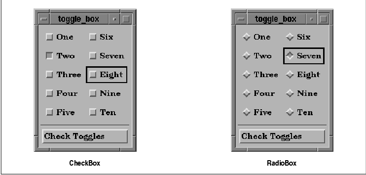
BTW. Motif (on X11) used small bevelled squares for check boxes and a bevelled diamond shape for radio buttons. There was no checkmark, cross or coloured circle. Bevelled in was active. Bevelled out was not.
Example: https://www.oreilly.com/openbook/motif/vol6a/Vol6a_html/V6a....
Kwpolska
Early builds of Windows 95 had diamonds too: http://toastytech.com/guis/chic58test.png
josephg
For some reason I've always found this design incredibly ugly. My eyes just hate it for some reason.
Nevermark
Nearly all gray, with flat black, no gradients to smooth anything. Gives the impression of harsh lighting.
Very sharp-edged 3D boxy window design creates heavy cumbersome feel.
Inconsistent pixelly fonts.
Oddly aligned text in button.
Diamonds happen to be a shape that maximizes pixelation.
Indent in vs. out is cognitive heavy to process, relative to something less pure-dual.
Black selection border doesn't have consistent widths.
Separation line between big button and little buttons, despite obvious size and shape differences that already make that distinction.
Extra little borders defining window box corners from horizontal and vertical borders - a distinction that surely didn't need highlighting.
No rounding. (Granted, rounding would look pixelated.)
TLDR; It looks like an industrial lead brick you really don't want to drop onto your foot.
FrontierProject
> Extra little borders defining window box corners from horizontal and vertical borders - a distinction that surely didn't need highlighting.
This actually designates an area where you can click and drag to resize the window. I'd argue that this behavior has become a ubiquitous expectation because of this design.
dfox
> Inconsistent pixelly fonts. Black selection border doesn't have consistent widths.
This is because the screenshot is apparently rasterized from data for print version (".eps.png") at a resolution that does not match the resolution of the two bitmap images in it.
kevin_thibedeau
The Motif colors were all configurable and the system defaults varied by vendor. You got a mix of beiges on the DEC windows version.
DonHopkins
"X will not run in these 4 bit overlay planes. This is because I’m using Motif, which is so sophisticated it forces you to put a 1" thick border around each window in case your mouse is so worthless you can’t hit anything you aim at, so you need widgets designed from the same style manual as the runway at Moscow International Airport. My program has a browser that actually uses different colors to distinguish different kinds of nodes. Unlike a PC Jr, however, this workstation with $150,000 worth of 28 bits-per-pixel supercharged display hardware cannot display more than 16 colors at a time. If you’re using the Motif self-abuse kit, asking for the 17th color causes your program to crash horribly." -Steve Strassman, Unix-Haters Handbook
https://news.ycombinator.com/item?id=25734498
https://medium.com/@donhopkins/the-x-windows-disaster-128d39...
Findecanor
When GTK 1.x and WindowMaker copied Motif's diamond, I hacked/themed both for personal use to make it a circle.
SGI had their own version of Motif with a look that was more like Mac and Windows of the time.
mwcampbell
To clarify, are you referring only to Motif, or the Windows 9x classic look as well?
musha68k
Since ~2013 Apple designers have been throwing over board lots of conventions the company had been itself establishing for decades.
I remember user interface design class at my university ca. 2005 where 20 out of the 30 best practice interaction design patterns originated at Apple!
Steve Jobs for the most part really cared and you could feel those priorities clearly: "it's how it works, not how it looks!"
Aside from some natural missteps, the "form over function" critique at the time was predominantly false. Apple is slowly getting there though, joining "ignorant web" as correctly called out here by Nikita.
The thing is that none of this is a joke or could be taken however lightly. It's 2024 and by now we've fundamentally realized the "Software is Eating the World" prophecy; living in a digitally permeated world.
Bad design is a moral issue, in worst case scenarios it has been killing people before and will increasingly kill or harm even more going forward. It always starts with the little things, especially so in design / engineering.
I desperately hope that Zoomers at least will start to realize that Millenials really fucked it up in that regard. I know, I know it also were the bosses pushing for this but we clearly should have said "no" much more often as the professionals (?) implementing this stuff.
There is much satisfaction waiting in learning; a full-grown craft with deep history.
Zoomers: Alan Cooper's "About Face" is a great start, probably super cheap these days as seemingly no one cares anymore.
anon373839
For a few years in the last decade, it seemed that UX design was getting recognized as a serious discipline rooted in user research. Then, somehow, it devolved into fashion. When/why did that happen?
j4yav
I'm sure there are many exceptions but a decent amount I've seen is portfolio-driven design, where the goal is more to have something eye-catching, unique and interesting that will look good in a portfolio and to show other designers, more than building something well considered and reliable/predictable. There can be a sense, especially amongst more junior designers, that the job of design is to add some style, and that design should be fun and much more like creating abstract art than making sure door handles are in a reasonable place and turn in the expected direction. The end result is, as you say, more fashion than function.
kossTKR
Does anyone have a design inspiration site that isn't this useless portfolio garbage?
It's incredibly annoying, and i say that with a an interest art, the abstract, cool concepts etc. but i want to see sites and interfaces with "actual messy real life content" not just one big image or whatever idiotic whitespace hell everyone's doing with way too much scrolling on Awwwards, Behance, Httpster, Gsap etc.
It's relatively easy to make a big font, a big picture and a 3d effect look cool, much harder to present 15+ items on one page and create a cool visual narrative around it that both grabs attention and lets the user go solo if he wants to without scrolling two miles.
I feel like a few newspapers were okay examples of this 5-10 years ago, but now they've also gone whitespace crazy.
We need a site like "Real life UX" or "Actual usable design" inspiration.
kibwen
> When/why did that happen?
There's no money in making a thing that works well, only in making things that look good. Effectively 100% of people who are using software are using it for things that fundamentally don't matter, so why should they care if the functionality is shit? Personal computers and phones are fashion statements, not useful devices. Business computers and phones exist to facilitate the bullshit jobs that employ the majority of the white-collar population. Follow the money; nobody with money cares.
rezonant
Maybe a bit cynical and hyperbolic, but the point is good.
I'd boil it down further and say it's a focus on short term gains over long term gains. If the pan flashes, that's a win, full stop. When the pan stops flashing and people don't want to use your software because it's confusing, that doesn't matter because they can just flash another pan.
wolletd
> There's no money in making a thing that works well, only in making things that look good.
I work in a company building vending machines and such and it's the other way around here. Most products are shipped with a pretty mediocre UI because it just isn't valued. The software has to run the machine, vend products to people and don't eat their money.
qznc
In other words: Make something people want. Ignore what people need.
tnolet
> There's no money in making a thing that works well, only in making things that look good
Amazon, AWS, Salesforce and anything Oracle entered the chat.
More seriously, I think it really depends. People will use and pay large amounts of cash for stuff that solves there problem and does not have a fancy looking UI.
ksec
1. 99.99999% of management have zero understanding of UX. So their view of UX is basically some designer making it "pretty".
2. Most UX design aren't probably taught. Especially Software User Interface.
3. A lot of Design in that era came from Web. And if we read this article we already know or could guess what web design were like.
4. It is my observation that Tech, or Silicon Valley historically speaking learns very little about history of their industry. Unlike many other discipline, things comes and goes like fashion industry. Combine with Hype machine and VC money. Apart from Politics or Finance there is no other industry that contains as much noise as Tech.
5. Conservatism ( Not politics ) is generally not well accepted. Finished Software is not appreciated. And if you cant improve, or remake something, there is no way you can move up the ladder. The fundamental of not doing anything hype or large changes is against Resume Driven Development model.
mopsi
Electron-based applications seem like a hugo factor. When native applications were abandoned in favor of Electron, designers stopped trying to match their designs to established operating system standards and began designing from scratch, with much poorer results, because they didn't have the resources and experience of teams that had worked on major OSes.
Prior to that, deviations from established standards (layouts, colors, logic) were seen as unprofessional and tasteless. Things like buttons with unusual colors made software look like a shareware hobby project downloaded from Tucows, and nobody wanted their product to trigger these associations. Premium software made for Windows wanted to have the look and feel of Word and Excel.
gherkinnn
It started as user-centric research and when the user became the product the intent of this research shifted.
endgame
Doing research on the user, instead of for the user.
pilgrim0
I’ll give my perspective as a designer turned developer. People have always conflated design with “desenho” (drawing). But design is supposed to be more about information architecture. It just so happens that what’s usually trusted to be architected by designers is materialized graphically. But when the whole ecosystem of training and employment robs designers of their impact by not integrating them in both higher and lower level industrial processes, they’re hopelessly left at their corner, with a lot of energy to spend on what they actually have a stake on: visuals.
undefined
gsich
Designers still want to work, so they change stuff randomly and sell it as "modern".
crazygringo
> Since ~2013 Apple designers have been throwing over board lots of conventions the company had been itself establishing for decades.
For decades, all the conventions had developed on desktop. By ~2013 it was clear that mobile required different conventions, and that it was important to also unify conventions to some degree across mobile and desktop.
Also, traditional desktop apps had largely limited themselves to the UX vocabulary provided by the OS's graphical widgets. But with the rise of high quality CSS and JS, websites and apps became more free to develop their own conventions, separate from anything coming out of Apple or Microsoft. Hamburger menus and pills and what have you.
So it makes perfect sense that Apple started to evolve more rapidly around that time. And good for them -- none of these rules can or should be set in stone.
(And please don't make this about generations, that's just silly. Trying to assign blame to entire generations is utterly meaningless. Generations are made of individuals who disagree with each other.)
yreg
I believe these rules should be changed rarely, consciously and very carefully. Perhaps it would be worth it for them to explain their thought process behind revising them in some developer session.
Meanwhile, every person working on design systems should think about decisions like these deeply. Designers, engineers, accessibility specialists should all talk together and come to some common ground before doing something like this.
jstummbillig
I am quite positive, that (despite this and countless others fun examples to the contrary) the average the UX floor has risen by a lot.
Sure, things regress and move in waves, but on the whole user design has been established as the primary of software development and that really was a not the case back when.
Take something like error handling in a form. In a lot of average software, it was not at all uncommon for a form to just say "Error" when something went wrong (or just not submit). Or lose all form input after unsuccessful submission. Programmers were unironically confused about why people would not just enter correct information. People then wrote books about how to design form errors. Now, basically every web framework includes at least some form of validation and error handling by default(-ish), and most people would be seriously confused if they saw something like the above.
If you find it easy to poke holes into this one, please consider the average across all the little things that go into not fucking up a form, which is still hard to get really good, but again I am describing something of an average expectation here.
I would pin this to two major developments:
1. Designers are increasingly everywhere. If you think "duh?", this is entirely not how software was made. Programmers, commanded by business people, made software.
2. Most programmers today are also designers, and I don't mean in the sense that they always were (designing the software), but as in "thinking about people using the product".
Again, this might feel like a comical thing to even say but in most places programmers were just not expected to do anything to make the users life simple, unless explicitly told so. That was the designers job. In fact, a lot of programmers considered it a holy duty to fight any feature that was merely a convenience, and were quite adamant that, surely, the user could simply be expected to suffer a little and work a bit harder to get things done, if that meant keeping the code base pristine.
couchand
I think your point 2 is absolutely on the nose here. It fits in with broader industry trends in testing and operations.
And perhaps that's where the OP's question originated from?
As we've watched the despecialization of our field in testing and ops, we've seen that things improve, as ideas are introduced more widely, while also seeing them get mimicked and cargo-culted when the ideas are diffused.
Maybe the coders who were fighting against testing mandates or devops or design thinking were just insecurely admitting to their own ignorance on these topics and asking for assistance in being able to perform their new duties effectively?
One value in specialists is the freedom that comes with specialization enables them to do their job more completely. Fred Brooks's surgical team could not be more relevant.
esafak
Which era's programmers favored code simplicity over the UX? I find this hard to believe.
jstummbillig
Mind you, I know this has probably never been the case looking for example at Apple, Google or other shops that worked in similar spirit, but as a mainstream phenomena you have to not look further than the late 90s or early 2000s to find that average programmers in mid tier companies harboured a mix of non-empathy, non-sympathy and user frustration over a complicated interface and a designers call to do something about it, was regularly met with arrogance, a sigh or a frown.
Of course, this can also be credited to the fact that ui design for software was at a much different place in general.
ksec
>Since ~2013 Apple designers have been throwing over board lots of conventions the company had been itself establishing for decades.
2013 was when we first witness it in effect. It started a little earlier inside Apple. When Scot Forstall was forced out, the whole Software User Interface falls to Jony Ive and he basically ripped everything out and redesigned it with iOS 7. There is a huge different, or dare I say 95% completely unrelated field in Software UX and Hardware UX. Apple then spend the next 3-4 years walking back on all the design changes made in iOS 7.
Unfortunately a lot of UX learning was lost during that period. Including the Seniors of Human User Interface retiring during 2015 - 2020. The group has also grown rapidly in terms of numbers under Tim Cook. A lot of the Steve Jobs design requirement and "why" were diluted with more new members.
The design from Apple today may still look beautiful, but they are no longer as functional as they once were.
undefined
robviren
I blame the human spirit. User interfaces could have been the one thing we collectively agreed to "stop innovating" on and delivered better experiences for everyone. People are unable to stop innovating. People paid to look at design can't just say, it's done, we did it. And now I fully expect for the rest of my life I will need to explore an increasingly complex labyrinth user interfaces for which I will one day be unable to figure out.
mst
> Alan Cooper's "About Face" is a great start
I'm not sure if I read all the way through it when I first got my copy but it -is- very good and I have it stashed for the next time I end up doing UI design.
Well worth a look.
undefined
crucialfelix
Actual radio buttons in cars were for the most part rectangular
https://www.shutterstock.com/search/radio-buttons-old-car-ra...
There's a good explanation of how they worked here:
https://www.physicsforums.com/threads/how-do-old-timey-radio...
barnabee
It's obvious with hindsight, but I had never realised that that is why they're called radio buttons!
arcanemachiner
Imagine the poor bastards in the future trying to comprehended the floppy-disk "save" icon.
crucialfelix
Those poor bastards are here now. I'm teaching my 7 year old all these strange words and icons. We carry so much historical garbage.
Izkata
I remember seeing a post like a decade or more ago of someone asking why you click on a little TV to save documents.
seabass-labrax
Me too! I had assumed that 'radio button' was a bastardization of 'radial button', referring to the very shape which the author notes is conventionally used for them.
rubymamis
Apple ditched square checkboxes long ago in Apple Notes: https://imgur.com/a/HLrnXn3
I believe it was this way since the introduction of iOS 7 in 2014[1] (article from 2016).
[1] https://osxdaily.com/2016/01/25/how-to-add-checklists-to-not...
deafpolygon
This may be petty, but this is one of the reasons why I don't use Apple Notes. The design.
sph
I bought a Macbook in 2015 because I always loved their UI design. Safe to say, whatever's going on with Apple Notes was not what I had in mind.
The best designers in the world, keeping alive the worst UI trend of making everything flat and white without any separation, border or shading whatsoever.
rubymamis
I like its design - it's simple and familiar and just works. The circular checkboxes are annoying tho.
punkspider
I chuckled when switching to dark mode on this website. The result is hilarious. When clicking it the page becomes dark and your cursor becomes like a flashlight. Definitely doesn't help with reading. Feels like it's a statement against dark mode. I love opinionated blogs like this.
Get the top HN stories in your inbox every day.
I’m surprised nobody has mentioned that iOS has had round checkboxes since forever? https://ux.stackexchange.com/questions/116712/apples-round-c...
Likewise I thought the article’s punchline was going to be the increasing use of on-off toggles instead of checkboxes. Like how the settings app on macOS now has more on-off toggles than ever before.
Personally though, my fav pet peeve remains the unclear toggle button. When the icon is white, is it on? Is it off? Does the line through the microphone mean it’s muted? Or that it mutes when tapped? No one knows, tap it a few more times to find out…